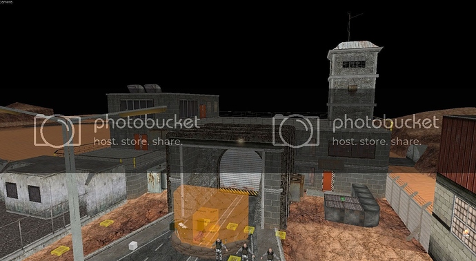
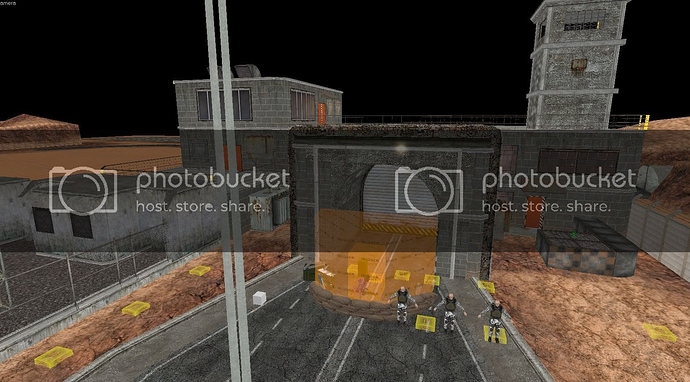
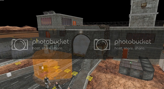
You should make two of them, like in your original 2-hangar layout…that looked nice, especially with the two streets. As a side note, I find it amusing that people made such a stink about this area originally. The scene where the Bradley is introduced uses the exact same hangar layout, but no one seems to be complaining about it.
Okay guys, a) or b)? Definitely one of the two, they do look an awful lot better than previous iterations.
a)
b)
Leaning towards a) myself
Will you solve this issue with Garg map?
https://www.youtube.com/watch?v=1TKeaXYS2qM
It’s not a big deal but can easily be solved.
about your question
B
if you removed the overhang on top I would say A, if not I would say B.
The door doesn’t look half bad and seems to fix the issue with the previous door design. However I vote for choice c), where you create two such doors, each leading to a separate straight road, as in the original iteration of this section. This bypasses the unnaturally narrow-looking roads in your current version and is consistent with your design in the Bradley scene. Make sure to keep the overhangs to the doors fairly short, as they don’t look too great.
An idea I have had about inside the garage… Have a radio playing the country and western music from CSS… There is a radio that plays some music in one of the maps… Have it near the door where the satchel trap is rigged to lead the player to this area or use some other public domain country and western music looped. This music and radio is killed upon the explosion.
I think it will add a workplace atmosphere… I think it would work well inside here also add more detail inside he garage like tools and lockers metal cuboards fuel cans etc
example
I’d go with B.
@Ronster
I wouldn’t say it would fit, since it’s it’s almost a day since HECU came there, and it’s unlikely they left it on.
Also, I may be late, but I have a nitpick about the Grunt wall scene: he flies out legs front, while he should fly out head front.
They left it on so you would go to that door 
wouldn’t really make sense, the reason you would go to that door is its the only way out.
ok well was just an idea… to make the area feel like a garage would no problem…
I can’t remember which map from CSS it’s from either anyway forget it
ok country rock am radio loop
https://www.youtube.com/watch?v=-dGeeXNmQIg
from cs_militia
logged for reference soundscape idea
Not really my cup of tea … 
I choose B
I think “A” without the exterior wall ontop but have the exterior wall in line with where the slopes start
removing central reservation
Damn guys, you’re fast… I not even had time to make my frankenstein-paintbrushed mockup to show you my idea. You’re faster than me with words, so I made this 3 minute crude job to show what I meant in my previous post:
https://www.dropbox.com/s/odn03kjomhp4xw8/DoorMockup.jpg
The building entrance is too tall. I think it needs to be shorter than the main building to be aestheticaly pleasing.
(Unfortunately I’m at work, so I unable to make a good photoshop work to show what I’m imagining now)
This basically but without the over hang arch but with the thickness and same textures used now pushed back to the point where the slopes either side of the door start
remove the dark wrap around rusty metal ribs
Something like that:
https://www.dropbox.com/s/jdzc6536xj1k2b1/DoorMockup2.jpg
Of course with textures matching the main building.
EDIT:
(The whole building in this mockup is a good example to inspire some proportions between the entrance and the main building… Or you can even “copy-paste” the same design of the mockup’s main building… The bunker-like style of surface buildings is the standard trend in ST topside areas).
exactomondo - defo this ^^^
Yeah, it looks best, IMO.
Very good, It is better now !
It’s perfect. This version fits perfect.


