Surface Tension Uncut - Re-Adding Cut Areas/Scenes (Expansion Project)

The pipes are model based, and I am not a modeller. The BM team didn’t model any destroyed pipes based on the gaspipes in that courtyard, so there’s no easy good looking way for that to happen. Though that DOES give me an idea, should my techniques for controlling him keep on failing.

The pipes are encased by an invisible metal brush which is set to break on touch (Garg only), with each pipe model being parented to their own individual brush. I then have a generic model/brush based end “stump” which appear on the ends of each pipe (as the gaspipes used in that courtyard don’t have their ends modeled because they’re supposed to connect together). This could potentially work quite nicely - but with one major problem - it could be quite performance hungry. Couple that with the fact that this courtyard is one of the least well optimized places on Surface Tension (it makes my rig, which is pretty damn powerful cry tears of agony), and you’ve got a difficult recipe.

Still, I may or may not give it a shot.

Quick progress report: Just finished C2A5H at 4AM. Took many many more hours than I thought it would. Tomorrow is pretty much C2A5G time, which I can’t foresee taking anything like as long (the map is much more “linear” rather than C2A5H which is circular, making things a LOT easier). There’s also much less to do on C2A5G as I’ve already re-worked it once before. Then it’s just fixing up the garg chase (don’t expect the entry to be the grand one I’d hoped for) and linking the levels together.

Easy way to balance the marines against the aliens would be to use logic_auto entities that give the marines initial damage with the “SetHealth” input. If you want to kill the unit outright, use SetHealth with a keyvalue of 0. Find a value for each unit that gets them killed after a while but not so quickly that the player is overwhelmed by the nearly full strength alien army.

RE: Garg Stomp

The animation that I suggested whilst would work as a stomp for the first second the rest on the animation makes it to long and canceling the animation also confuses the npc and makes it choppy.

So I had a go but nothing worth posting a video demo about… Which I would have done had It would have been successfull.

But my original idea would work of having a garg stomp if you were to escape down a hatch as you really would only see the garg out of a small hole so even more of a cheat to make it happen. Anyway I think that is the only possibility for the garg stomp. :frowning:

I just been thinking about the zombies that you have in C2A5G and it’s a shame that nobody has yet done a HECU zombie model… But this would be the zombie to see in this last part… To further show the HECU are losing.

If anybody can please make the HECU zombie just do it please :slight_smile:

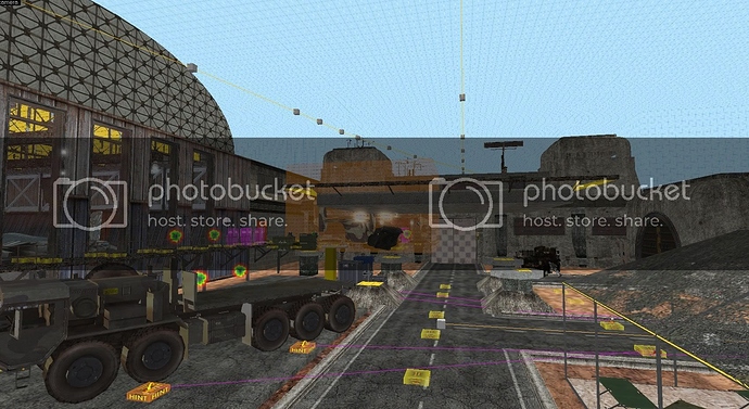
Here’s what I’m doing with C2A5G’s Helipad. It’s a compromise between realism and not having to change the entire area:

What do you guys think? It does have some problems - it means you can’t see the Harriers/Mantas approaching until they’re right above you making it easier to miss it and less impactful.

I’ve raised it quite high to make the road passing through it make sense - this does and can happen in reality - it’s currently the same height as the large tunnel doors behind it. Obviously I’m going to make it all look good, but there’s no point doing that if it’s an awful idea - I need a second opinion!

Obviously I just started so don’t comment on the way it looks weird (especially the supporting columns), I just want to have an opinion on its positioning!

EDIT: I was also thinking about curving the road to the left of the helipad to prevent that slightly weird design, but I think that the way in my picture is probably better.

Well, I think U hit the nail now :slight_smile:

I think this is awesome! Just some pilars under it or something…

I think it’s an improvement… Yes it’s really good…but please don’t lose the walkways by the hanger and can we get up to the helipad?

for the view of the great skybox you spent ages on :slight_smile: !!!

Have the manta fly overhead from behind that destroys the Osprey? as the player will turn to look at the harrier and manta that fly past… Have another manta appear very soon after the chase so the player will follow this mantas flight path back towards the heli-pad

Yeah, the walkway will extend up to the Helipad. I’m glad that the idea seems to be alright with people, I was worried it was gonna get slammed and that I was an idiot for thinking it would work! Any other opinions? I’d like to get a nice rounded body of thoughts before sticking to this design, as it’s pretty “radical”.

mmm…It means that your map gonna lose the wow-effect when the air vehicles flly toward the player.
The manta-harrier chase is a top feature of your C2A5G, I hope that this new layout won’t jeopardize it too much.

You could lower the building or lower the entire last part of the map(is it doable?)

I don’t think it will effect the harrier being chased by the manta but I do think it will effect the manta destroying the osprey… I think this manta that destroys the osprey should now come from behind the player when looking at the osprey on the helipad

Can you raise the height of the Harrier manta’s or bring the trigger back to nearer the end of the road or do both?

Excellent news on being able to take in the amazing scenery… That will really enhance the map 10 fold IMO

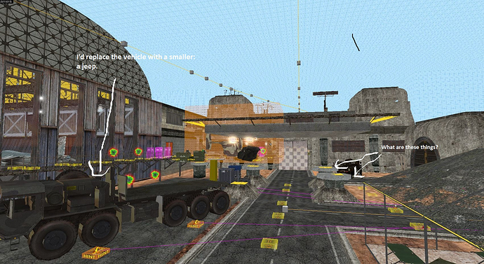
I made an Img to explain some concerns.

I hope you don’t take it wrong but I think that this part of the map is getting claustrophobic, that’s why I suggest you to replace that cargo-vehicle with something smaller.

the round things are the bases of pillars which are not there yet which will hold up the helipad…

Can I suggest a metal grate walkway that runs around the perimeter of the helipad square… with railings… This will give it a nice finish.

I think you may be correct on the big vehicle that is there now though as the area is changing?

some sandbags a jeep and some more crates will do. But probably needs to be desert sand and not tarmac here now where the big truck is

Those things are the pillars. He said those were temporary.

I think this is a change for the better layout wise. I can’t really think of any reasons this couldn’t work.
I say go for it, I’m sure it’ll look great after you’ve given it your signature detailing treatment.

Don’t fucking change that!
It’s perfect

I’m not talking about forget about freeman but the end of surface tension. When you escape from gargantua, you climb on tower, a guy from radio says they are commencing airstrikes, then you blast your way with airstrikes. And after you blast your way, just before you go through that blasted door, airstrike begins to shot in random position. Play half life source or half life 1 and you will understand what I mean. It’s just before forget about freeman chapter starts.

reference video

https://www.youtube.com/watch?v=_84wk1jjSok

It’s because the door that leads to FaF is destroyed by an airstrike but in BM, you manually turn the valve to turn the gate open, but it closes eventually. In HL or HLS, it is open but needs to be closed for you not come back anymore so Valve made an airstrike to shut the way to Surface Tension down. Sound effects could do the trick.

I’m going to have to play the dissenter here regarding the pad. The one good thing about the new location is that by elevating it, you’ve made it such that the Osprey appears in a more open space, which is the aesthetic that you should have been going for all along. However, from a realism standpoint, you’re really not adding much because now the red door and gray doors are sitting directly BELOW the helipad. This doesn’t make much sense design wise and quite frankly seems downright dangerous. I’ve never seen a helipad with such a layout. Also, the placement of the pad will make the hangar walkway look really awkward once you try to connect it because of the garage separating them.

Eli makes a good point regarding the claustrophobia though I really want to keep the large vehicle. Once you start adding the pillars, the area’s going to get a whole lot more cluttered and won’t look as nice. I feel like cuts in the content would have to be made for aesthetic reasons, but the LAV battle would really need to be kept in the section. The other problem with this layout is that you will have made the scripted sequence less impactful, which is a shame because it’s a good one. Your road concern is a nonissue…it will look fine if you keep this pad placement.

I was going to suggest a more moderate solution for you after the alpha test, but since you’re thinking about a radical revision for realism’s sake, there’s only one solution that truly works in my mind: you need to expand the courtyard significantly, even if it’s a pain in the ass.

You can keep everything to the right of the road, including the road itself. However, the hangar and everything else on the left wall needs to be moved back significantly in order to accomodate a more centered position of the helipad. You can even remove a section of the red wall lining the left side of the road to do this but you’d have to make sure it’s acceptable aesthetically. The helipad should be placed at GROUND level, which is the most realistic option and would make the scripted sequence w/the marines retreating to the Osprey look nicer because the hangar walkway would connect to low ground, which also makes sense. You can even place a pair of marines just outside the Osprey providing cover fire for added effect. The advantages of this layout are many fold because 1) it removes all issues regarding realism period 2) no more sense of claustrophobia 3) scripted sequences would be better because everything is closer to the player.

If you’re worried about people missing what’s going on overhead, add a gunman or sniper on top of the building. That’ll draw their attention upwards so that they catch the scene.

I think perspective may have played a trick on you, my friend. There are 600 units of distance from any door and the helipad. That is in no way sitting directly under it.

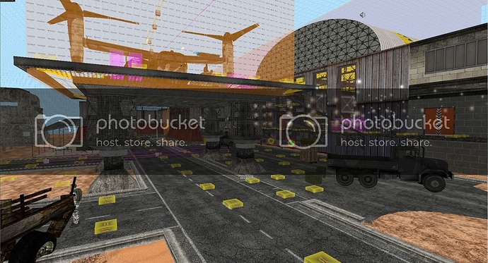
Here is its current iteration with the view from the big gray door:

It doesn’t feel cluttered at all. I actually feel I did a pretty damn good job considering the limitations that are on me. I won’t radically redo that area, probably not even if the feedback is negative. It’s far, FAR more work than you may realize. I think this is the best compromise.

I’ll wait to see if perspective was the problem before I address your points.

Founded in 2004, Leakfree.org became one of the first online communities dedicated to Valve’s Source engine development. It is more famously known for the formation of Black Mesa: Source under the 'Leakfree Modification Team' handle in September 2004.