Surface Tension Uncut - Re-Adding Cut Areas/Scenes (Expansion Project)

hmm… oh, well no big deal, it only happens their so I’m not gonna spend all that time reinstalling over it lol if its not a bug with your map then nvm it :stuck_out_tongue:

nice job on these, been playing through them, they do match blackmesa flawlessly, aside from the larger frame fluctuation you really cant find the seem between your maps and the originals, and I like your direction, it all fits smoothly together, it all makes sense that your going through it all… not just walking into random warehouses like in the original HL, while at the same time you kept the same feel, kudos, black mesa devs should use your uncuts as a template if/when they decide to add the cuts!

also, I keep hearing about this stuff about devs leaving during ST, I’m curious of the details lol

It’s a nice idea, and it IS actually doable using a combination of point_template, env_entity_maker and logic_case. VERY easily doable in fact. But…it goes against my basic principle for this project - trying to make this stuff fix Black Mesa as seamlessly as is possible. Seeing as nowhere else in Black Mesa does it, it would make my sections stand out. And random isn’t necessarily better - it can be frustrating sometimes. It’s a nice idea, but I can’t bring myself to do it.

As for the headcrabs, pretty much all of my vents are home to Snark encounters. Having headcrabs too seems like a bit much.

Thanks for the kind words. The framerate inconsistency is a result of the fact that I am useless at optimization (hint brushing mainly, areaportalling and occludering are baby’s first optimization). It’s also partially a product of the vast amount of NPCs on my maps, as well as the fact that they’re quite large and open, which is always tricky to optimize. I hope to improve it with later versions but I wouldn’t expect a dramatic increase in performance at any point.

If the Black Mesa devs decide to re-add the cuts, I would strongly hope that they use my stuff! Not just because of the whole being immensely proud of having my own work included in Black Mesa, but the fact that it seems far more pragmatic for them to use my stuff. I’d be quite happy to let them do whatever the bloody hell they like to my maps. They’d already have a pretty solid basis for whatever they want to do with it. It seems pointless for them to waste their time completely redoing something which I (hopefully) feel was already done to a pretty good standard. It seems a waste of time when their efforts could better be spent towards fixing other areas of the game, or adding OTHER chapters in! I hope that’s how it’ll go, but you never know really.

only reason i said use your maps as a template is because, since they can make new material, they can take your ideas and concepts and make them look even better! (I know… its hard to imagine lol) it would be nice to see these in bm officially :stuck_out_tongue: and I’m now on FaF, so that concludes my run through your maps, they were great, and did a great job telling the story, good job, and thanks for making black mesa more complete!

and yea, I knew all about the optimizations issues, I’ve been lurking this thread since you started it lol just only recently decided to sign up and post for bug posting :stuck_out_tongue:

so with me having finished the maps (and me hating doing stuff over in single player fps games) I’ll probably betaking my leave… may lurk around out of curiosity of what changes etc. though

So once again, thank you for these, good luck with completing them and have fun!

Text, you might want to do an update of the main post to make installation instructions (and playability of your maps) a little more clear. Add in my mention for the earlier save(s) (where the map doesn’t compile correctly)

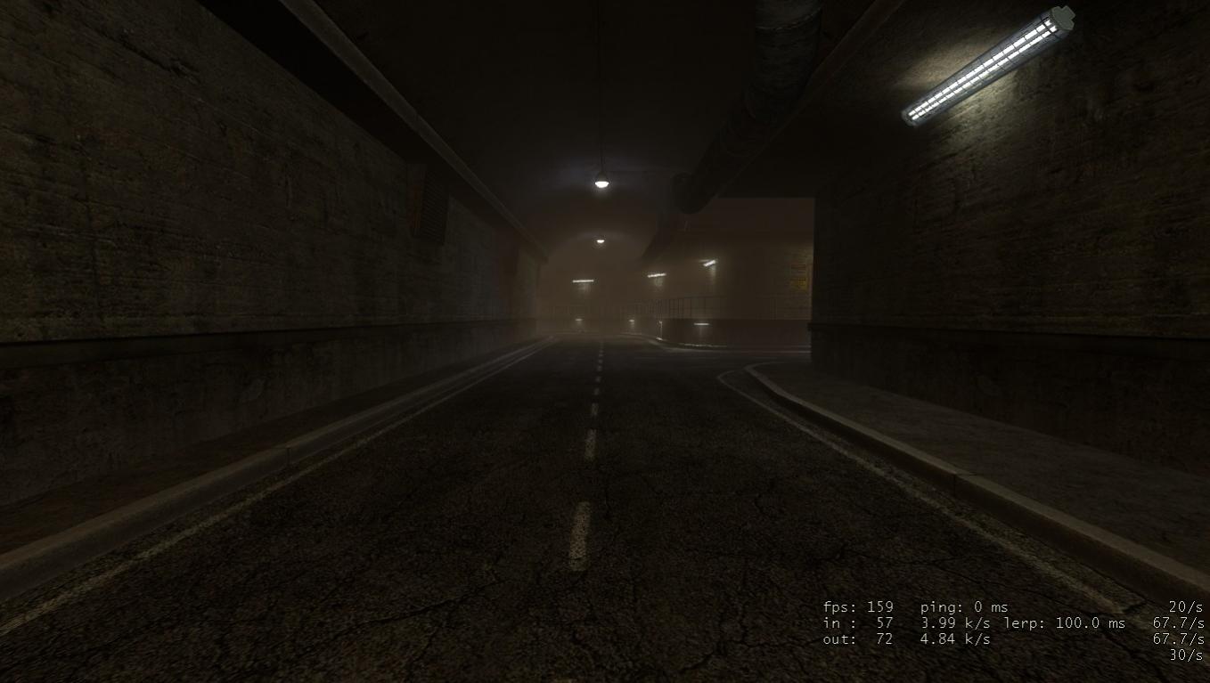
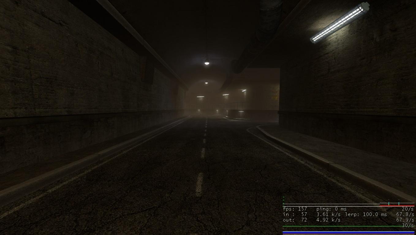
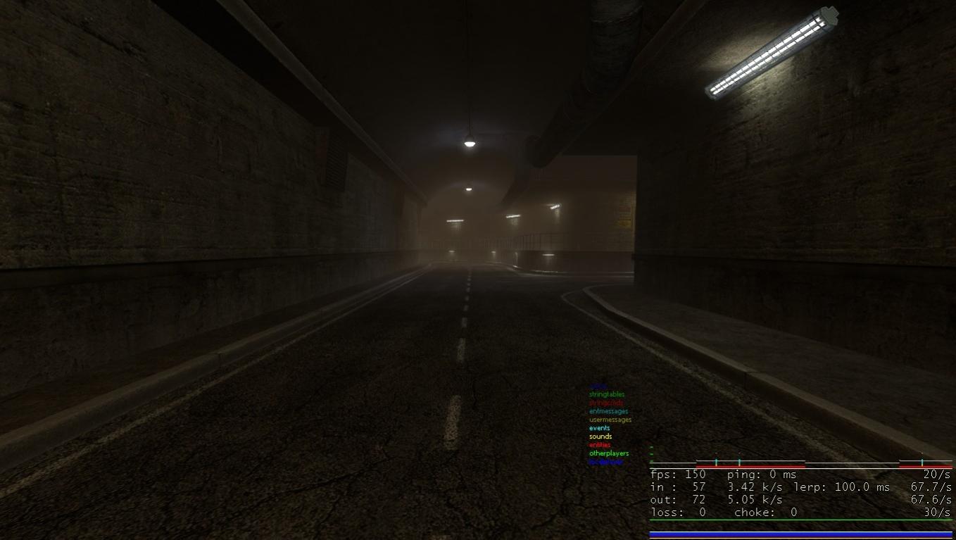
You may also want to add in the commands list “net_graph (1-3)” A few screenshots to show you what they do (and this may be useful for you for optimization); observe the lower-right corner.

Little snippet on the Valve Developer wikion it:

Net_Graph setting 1:

Net_Graph setting 2:

Net_Graph setting 3:

Anyway, the third setting may help you with optimization.

Additionally the last line on “Net_Graph 3” (ones with loss and choke) has to deal with the connection data. Not really useful unless you’re on a server.


Net_graph isn’t terribly useful, in all honesty. Most players can visibly see when they’re losing frames, beyond that the specifics can become…over-specific. Don’t worry, I know ALL ABOUT this sorta stuff, I’ve been working with the Source engine for years. Net_graph is something I normally use. If a player knows they’re having frame loss in a certain area, that’s all I really need to know.

+showbudgettexture is a bit more useful.

Mat_wireframe x is more useful.

I just don’t think it’s a terribly good idea to inform people about these commands. The less I ask of my players, the better. Those who know about it will probably do it, and if they don’t know about it? It’s probably better not to ask them to do stuff like that.

But I will update the OP a bit later about using savegames. That could cause problems.

A little late to the party, sorry, but I figured feedback never hurts.

I had a few bugs with the first beta you released, such as after you use the TOW to blast that door, props would float and skitter across the ground in a similar fashion to water hitting a hot hot pan (Leidenfrost Effect), and rockets would go through walls and not explode when the came in contact with NPCs (they would just sit there against the NPC and spin). I also had some missing textures.

I downloaded your most recent version and ran into the security door glitch where the skybox would show. Another interesting thing to note is that even though I couldn’t see the NPCs through the skybox, they could see, and shoot, me as if there were no door. I downloaded your hot fix and that solved that problem. I played through the 3 levels and stopped after the level transition to “Forget about Freeman” and ran into none of the glitches I had before. Something I did have that’s beyond your control is that the osprey pieces fell off the helipad onto the walkway on the hanger side, blocking access to the door. Fortunately I had just enough room to squeeze onto the helipad and jump onto the walkway from there.

Something I noticed on c2a5g was that if you backtrack a little bit after the first harrier is being chased by the mantas (just before the helipad), you can see them de-spawn at the end of their paths.

All in all I am very impressed at the quality of these maps seeing as they were made in such a short time. I know this is still a WIP and very early beta, so I’m sure that the final version will be as close to bug and glitch free as possible.

@Text. Fair enough, I use it commonly when playing competitive source Multiplayer games (Fortress Forever mostly) so I tend to be very into tweeking my frame rate.

Just finished a play-through of the new version. You really fixed a lot and implemented a TON of the feedback. Thanks for that. These maps are pretty much perfect at this point. I didn’t find any game breaking bugs that weren’t brought up already.

(The parking garage door worked great for me with the hotfixed version and I didn’t have any missing doors anywhere)

Here are some minor things, though.
https://i.imgur.com/WbzJB.jpg
After loading the first of the maps through the console you can instantly turn around and see this big crack in the gate door. I don’t know if this still happens if you transition from the previous ST map into your map.

https://i.imgur.com/7GKvH.jpg
Once you drop out of the parking garage and you’re standing on the air conditioning/vent thing if you look at the sun it seems to act very strange disappearing and reappearing when you slightly move your cross-air.

https://i.imgur.com/1RrWE.jpg
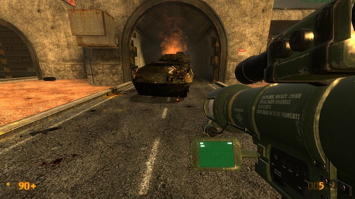
The tank that gets destroyed by the manta beam doesn’t seem to have any collisions with physical objects. You can throw cinder blocks and barrels right through it.

https://i.imgur.com/scHln.jpg
Inside the gasworks building if you crawl under the pipes area on the ground floor you will come across a few pipes with no textures on the ends. Note that there is a cool little area in the corner back here you could hide a health/battery or dead scientist in if you wanted.

https://i.imgur.com/0dC23.jpg
The same as above on the other side of that pipe.

https://i.imgur.com/43RTI.jpg
After you go through the security door with barney if you look up right away you will see that you’ve left an extra light on this beam that clearly doesn’t fit in with the others. When you go up the stairs you go through a map transition so when you’re up there this light is no longer there, but from the ground when you first come it is clearly off and not supposed to exist.

https://i.imgur.com/Pb0x3.jpg
Seen here from the top without the odd light.

https://i.imgur.com/6lzWg.jpg
I would also like to note that the top light seen here is simply too low and looks weird when you go up these stairs and your head is practically in it. I would suggest removing that last light. Take a look for yourself and see what you think in game.

https://i.imgur.com/UA6E8.jpg
In this same area if you fall back down off the girder with the two suit batteries and go look at the door that you came in with barney it’s a different kind of door and the handle that was there before is gone. Obviously very minor, but it just seems funny if you notice it.

MORE NOTES

I agree with whoever else said that the pipe hatch that the satchel pipe scene takes place at should be closed when you come up to it after the explosion. It just seems weird that it is open again. Simply going up close to it could have it open for you or put a wheel thing.

Also I dunno if you’re aware of this or not, but you can skip the entire turning off the gas/fire scene by just walking through the fire in the pipe fairly easily and take minor damage.

Lastly I found the garg going into the tunnel after you toward Forget About Freeman created it’s own little glitch. The problem is there’s a level transition into FaF and afterwards you can walk right back out into the garage area and the garg will completely ignore you or just shoot his fire all over at the wall and the floor (as you pointed out). This just seems odd and I dunno how you would fix it really.

Personally I still think you should add in a few environment shakes and debris falling from the ceiling as you go down that tunnel alongside sounds of the military shelling the area outside. This was how it was in the original game and really made the part right at the start of Forget About Freeman where the entire ceiling falls down make sense. I don’t think it would require too much work and would really help the atmosphere at this part.

Awesome work. I will do a few more runs later and see if I find anything else.

Thank you for this feedback, there’s a lot of good stuff here which I actually have been addressing as I read it.

As you’ve said as far as I can tell it’s MOSTLY minor niggles at this point to address, and you’ve certainly raised a few which I am addressing.

THAT GODDAMN LIGHT at the end of C2A5H though. I think dragunov pointed it out earlier. It still upsets me that I somehow missed that! It’s so glaringly obvious! I’ve tested that map hundreds of times and never once noticed it. Frustrating as hell.

I had no idea about that tank debris, but I THINK there is something simple I can do about it, so I’ll give it a try.

I can’t understand also how you’re climbing through the furnace. Looking at it now, the trigger is set to do 10 damage every half second, which also DOUBLES every half-second, with a cap of 50 damage. It takes at least 2 seconds to climb through there, so that’s 10 + 20 + 40 + 50 = 130 damage. I’ll increase it to near STUPID levels (25 damage with doubling every half second and a 100 damage cap) to try and prevent that being exploited though. That’s 25 + 50 + 100 + 100 = 275 damage, which I hope no amount of battery power can negate.

But thank you. I’ve already addressed most of your feedback! This is great, so many improvements being made.

I notice that 3 people now have commented on the hatch door for the satchel pipe scene. This was a deliberate design decision for a number of reasons I shan’t go into, but clearly a few people think its a problem. I always thought that opening that kind of hatch from the inside was really, very dumb. But it seems many people are taking issue with it - so I address others in the thread, do you think the hatch door re-opening after the satchel pipe scene is bad? Should I make it openable from the inside? This isn’t difficult to do, I just thought it wasn’t a very good idea!

I just played through your levels, and I must say they are fantastic. They really fit quite beautifully into the game. You’ve done a great job restoring the tone of surface tension.

I actually managed to get through my first playthrough almost completely bug free. It was only after I went to replay it to grab screenshots of some of the minor texture bugs I noticed around the place, that I started to run into problems! :stuck_out_tongue:

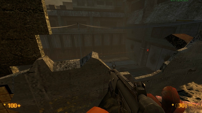
I managed to replicate the weapon loss bug on the second jump pad in the multi-story car park. Just after I got this screenshot of an extremely minor clipping error above the entrance.

After reloading, I managed to get the game to crash a few seconds after opening the door to the multistory car park! So not much luck on this playthrough. Think i’ll leave it until tomorrow.

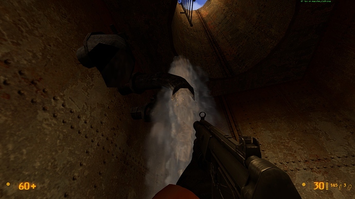
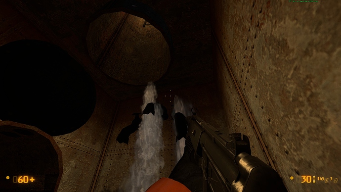
Though while you’re on the hatch sequence, just one minor detail I noticed is that the water cascading down, just where you fall in, seems to clip above the pipe slightly.

If your taking opinions on the hatch being open, I share your view that it’s silly to have it open from the inside. If possible, you could maybe have the soldier re-open it when you are about half way down it the second time? Tbh it’s probably fine the way it is now.

just some feed back on design all minor mostly ideas.

  1. the garage you enter into should have more xen plant life around it its got two jump pads and is dark, from the looks of xen plant life it likes dark areas.

  2. I think its strange that there are no medic soldiers in the battles or the bodies. at least I didn’t see any. also think its strange that all the bodies are missing helmets or any other gear.

  3. I knwo that sniper isn’t to be killed out right, but that isn’t really clear for many reasons, one you can see where he is firing from, 2. you have RPG ammo from the last map and the dead guy in the road so most players will shoot at it. 3. its a sniper logic says kill it before you move. best way I can think of to fix this is to raise the tower its in and put the grate texture out around it (like they do on some tanks to protect from explosives) if you make it look like the snipers well armored most players will not try and kill it. also would bee good to put more movable cover on the roof and remove the cross beams they jsut get in the way and can get players killed.

4.on the first map you give the player 2 turrets only the first one is of use and even so not that much as it fires at the player causing most to shoot it. suggestion, put it near the humvee on its side and away from the soldiers so grenades will not kill it.

  1. I played the garg chase a few times and 2/5 times the soldiers would survive, this is a minor bug but they will fire on the player after the garg roars. (only happened second time). also one of the times the aliens all died before the garg entered the room resulting in me getting some tank fire to the face.

First off, thanks for the acknowledgement in the Readme file. If you could do me a favor, on the next release use my real name, Tian Wang. Who knows, this could come in handy :slight_smile: . Now on to business…

0.81b critique
General impressions

It’s impressive how many fixes you’ve made to this version and this has really improved the visual appearance and gameplay of the mod. However, there’s two major issues that have cropped up. The first is optimization…some sections seem to perform much more poorly now on my computer compared to the previous release and I’ve been getting random crashes more frequently. The second is balance. Most of the battles are now giving a little too much of an edge to the HECU…they win most of the key engagements on hard and this is negatively impacting the storytelling. Ideally, the aliens should win all engagements (w/the exception of the tank battle) but just by a narrow margin.

With respect to health/ammo, the new changes have improved gameplay significantly. The only issue is in C2A5G, where the health placements are a little too generous. The problem area extends from the .50 cal vort shootout leading up to the car shop. Most of my new health/ammo suggestions will focus on rearranging the placements, w/the overall effect of removing 2 health packs. Again, I’ll outline everything by order of playthrough for easy tracking. Italics indicate new suggestions. Past suggestions that I’ve made for you will be kept concise. Red=critical, Yellow=important, Green=ammo/health placement, Pink=enemy placement

ALSO, DON’T CHANGE THAT SATCHEL SCENE! IT’S PERFECT! THE MARINE IS THE ONE WHO OPENS THE HATCH TO CHECK TO SEE IF YOU’RE ALIVE AND TO SHOOT YOU IF YOU ARE. IT MAKES PERFECT FRICKIN SENSE!

General
[COLOR=‘Yellow’]Lower the road extending from the TOW courtyard to the end of C2A5G so that it is at the level of the desert terrain. Add dirt to some sections of the road to create a more blended appearance. After much mulling around and testing, I do feel fairly strongly about this change in C2A5G (less so in C2A5H) as this will bring your work more closely in line w/the rest of ST. Again, if you consider doing this, try to get it out by the next beta for bug testing purposes.

[COLOR=‘Red’]Improve the appearance of C2A5G and C2A5H in the map editor.

[b]C2A5G
.50 cal vort shootout[/b]
Add xenofauna by the silo door (just the moss).

[COLOR=‘Lime’]Delete the magnum and all magnum ammo by the dead HECU (to be rewarded later). Replace w/generic shotgun or MP5.

Garage
[COLOR=‘Yellow’]The AI battle is about 60/40 on Hard, w/a slight edge to the HECU. What tips the battle in their favor is if they can kill the Agrunt quickly. I think having an even match-up here is bad gameplay wise because it usually just leaves one nearly dead unit or 2 nearly dead units for the player to kill. After that, there’s really nothing much to do in the garage, which makes the area kind of boring. [COLOR=‘Pink’]Consider replacing a vort with an Agrunt or use your previous version to tip the balance more to the aliens.

In general, needs a few more signs to enhance its detail. Put “Exit” signs over the spiral driveways. Add things like “Stairwell,” “Floor 1-3” etc.

[COLOR=‘Lime’]Delete the health kit by the zombie ambush on the 1st floor. Replace w/a battery (so 2 total there). This accounts for the deleted 3rd battery in the car shop.

1st floor door to the stairwell should be openable from w/in the garage to keep consistency w/the rest of the stairwell doors.

Don’t park the hummer in the handicap zone of the 1st floor! Move it over to the next spot.

The color of the pavement in the spiral driveway is noticeably different from the pavement in the garage. Ideally, they should match.

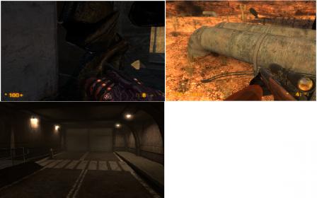
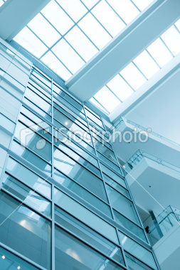
[COLOR=‘Yellow’]The new windows atop the car shop have a weird opacity effect where they disappear entirely when viewed from certain angles. Get rid of this effect if possible or give the windows a slight green tint so that they are still visible from all angles. Also, the windows are too new for the old buildings and don’t fit…they will look better w/a frame/grid support (image 1 top L, image 3,4).

[COLOR=‘Pink’]Replace the vortigaunt on the 3rd floor w/a zombie and/or headcrabs. Realistically, he should have been helping his buddies during the garage fight. This change also reinforces your zombie attack on the 1st floor. [COLOR=‘Lime’]Delete the health kit by the HECU and replace w/a magnum and 1 magnum ammo box.

Marines vs aliens
[COLOR=‘Yellow’]There’s a fairly major optimization problem here that didn’t exist in the previous version. The game crashed twice for me as I attempted to run to the AC unit from the 3rd floor garage. A major drop in framerate starts the moment the aliens spawn.

[COLOR=‘Yellow’]Move the blue crates such that they do not overlap the garage door. They should be placed between lots 2 and 3 to appear more realistic. This will also make them more equidistant to the current alien and HECU spawns. I’m highlighting this as an important issue because it is adversely affecting the AI fight balance. You must fix this first BEFORE you rebalance.
[COLOR=‘yellow’]On Hard, the HECU win ~75% of the time. There’s several reason for this: 1) by flipping the HECU spawn position, you’ve allowed them to use the cover of the blue crates extremely well, which allows them to exploit the alien AI by forcing both the Agrunts and vorts to melee. 2. Vorts have a slower attack rate, do far less DPS and have less health than the HECU. Their energy attacks frequently miss w/the crates providing cover…and a couple of missed shots is all you need to tip the favor to the marines. Add another vort spawn once you move the crates and test from there.

[COLOR=‘Lime’]Delete 1 medkit.

Turn off the light on top of lot 1. All of the other lights are off and having one on during midday is a little unusual. You’d have to be as dumb as a rock to not realize you need to go into the vent, esp. w/that blatantly obvious ladder.

Vent drop/car shop
If possible, make it so that player can see through the bullet holes but keep the lighting effects.

[COLOR=‘lime’]Delete 1 of the batteries the player drops down onto (so 2 total). You don’t need so much of a buff w/only 3 marines plus the snarks now work wonders!

Delete the flying sparks when using the lift w/the extensions. A functional piece of equipment shouldn’t be grinding against the shop’s floor.

[COLOR=‘Yellow’]The windows of the surburban do not lower when the vehicle itself is lowered. They just stay in the air.

TOW courtyard
[COLOR=‘yellow’]Optimization feels slightly worse here now but nothing major.

If you keep your current layout, delete the parking bumper where the old lamppost used to be and replace them w/a pair of highway bumpers (you used 3 of them in the garg scene), which will look better (image 1 top R).

Delete the big ugly black mark on the Agrunt hangar door but keep the 2 little ones. You already used the big mark outside the garage and the materials attached to them are different from the hangar door. Plus the mark makes it look like the HECU were trying to destroy the door to unleash a flood of Agrunts on them, which makes no sense. Honestly, I don’t think you need to mark the door to tell the player where to go but if you want to, a much better effect would be to introduce some small cracks in the door and add a pounding effect (like the naked grunt in QE or the zombie in the opening of C2A5G, but more frequent) to show that the Agrunts are trying to break down the door. This would make the TOW emplacement make even more sense, as the marines are trying to set up a trap to defend themselves.

[COLOR=‘lime’]Move the deployable sentry to the back of the M35. It actually works more effectively when placed by the vehicle because it’s more accurate at close range, lasts longer w/the vehicle providing cover and diverts hornets when placed away from and off-sides to the player. Plus it prevents the sentry from backfiring on the player…this happened to me several times in the courtyard. Add some green crates on the vehicle and some undeployed turrets to improve believability. Note there is also a bug w/the sentry. If you tap it too hard against a vehicle, you will destroy it…I first noticed this w/the sentry after the TOW courtyard.

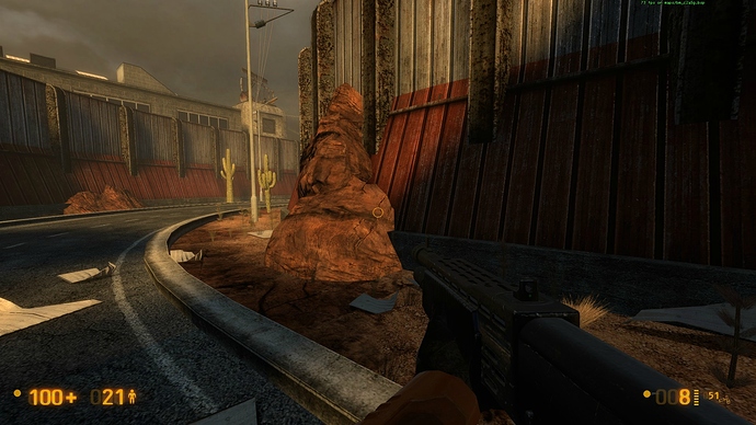
Delete the cactus in the little garden. It’s abutting the rock and looks unnatural near the tree and other leafy plants.

The AC unit is illogically placed as it’s “protecting” the main entrance. Perhaps change it to something else, shrink it or move it closer toward the petrol station to free up space, especially now w/the hummer acting as effective cover.

Delete the metal railings on top of the hangar entrances. Functionally, they serve no purpose and are inconsistent w/the design in the rest of ST.

[COLOR=‘yellow’]Harrier is still tilted just prior to take off. It also needs an exhaust trail immediately after takeoff as it currently looks like it’s magically floating. Increase the sound of the takeoff…I didn’t hear anything at all.

Background textures are too orange and stand out. They need a little more detail.

Road leading to Osprey
Delete the plants growing on the first large rock.

[COLOR=‘Lime’]Move the sentry from the M35 to the LAV courtyard and rest it on top of a green crate. As it can’t be controlled by the player and has limited ammo, putting it closer to the actual battle will give the player much more control over what and when it targets.

[COLOR=‘lime’]Delete the MP5 grenades, as they encourage script breaking during the tank battle. They can be moved to the .50 cal in C2A5H or the gasworks (by the HECU corpses).

Osprey/LAV courtyard
[COLOR=‘Yellow’]Still the area in C2A5G w/the biggest FPS drop…feels the same compared to the previous version though.

[COLOR=‘Pink’]On Hard the HECU win here 60-70/40-30, but I think this victory should almost always favor the aliens. Consider replacing a vort w/an Agrunt, especially now w/the LAV buff and the marines that come out firing.

[COLOR=‘Yellow’]Have the marines guarding the LAV spawn BEFORE the silo door opens. Currently, the player sees 4 floating machine guns and then 4 marines magically appear. It’s cute.

[COLOR=‘yellow’]Agrunts must be able to melee the LAV from ALL ANGLES. Currently they can only attack the SIDES of the LAV so when the grunts get into melee range, most of them will just stand there and look stupid.

The white desk underneath the army tent looks really out of place. Either delete it and put the map on one of the green crates or add some chairs.

[COLOR=‘Red’]Destroyed Osprey debris causes damage to the player. This needs to be fixed. If your work gets integrated into BMS, let the devs know about this.

Fix the J-hook section underneath the hanger to make it more consistent w/the new pavement design and delete the plants growing out of the pavement edge. Otherwise good work on the revision to this area…it looks much better now (Image 1 Bot L).

A white light is missing on the ramp side of the Osprey helipad.

A small section of the desert terrain texture is missing by the far road (Image 1 Bot R).

Ad[COLOR=‘Lime’]d a battery inside one of the destructible crates below the helipad.

C2A5H
Opening section
Have the vortigaunt face the health charger and use the heal player effect in HL2 to create the sense that it’s using the charger. Alternatively scrap this sequence, make the security zombie room accessible and place the charger in there. This looks better anyway.

The alien grunt that flings the marine has some texture issues when it uses its melee attacks on the player (hornet arm clips through unbroken wall).

[COLOR=‘Yellow’]Add a pair of dead alien grunts and a vort near the broken wall to justify the new machine gun fire and show why the section was targeted for destruction. Reduce the sound of the gun fire (and possibly make the pattern less repetitive) as it currently seems like it’s coming from point blank range while the player is still in the building.

The inaccessible room w/the dead Barney is too new/clean for this building. It should look more like the room containing the marine-throwing Agrunt.

Tank battle
[COLOR=‘yellow’]Still the area that consistently crashes for me after several reloads. The optimization here feels worse now, w/more framerate drops.

Extend the swath of destruction cut by the manta beam to the tank. There’s a small segment missing.

The outside door of the hut leading to C2A5I should be locked like the inside. This makes the most sense as why would one door be locked and not the other?

Satpipe and furnace
Consider fixing the embedded effect of the furnace.

When placing an explosive barrel in the furnace, the detonation should hurt the player. Alternatively delete the barrels (why would anyone put explosive shit by a furnace anyway) and move the blue barrels over to the “barrel storage” area.

[COLOR=‘yellow’]For the furnace puzzle proper, consider redesigning the pipes such that the horizontal section of the blue pipe is swapped w/the yellow pipe. You will have to decrease the height of the vertical segment of the blue pipe to accommodate this change. Then put the valve holder on the TOP floor and the valve on the BOTTOM floor. This makes sense as the valve fell due to gravity and gameplay wise would make players hunt for it…currently this “puzzle” seems a little too obvious as the valve is right next to the blue pipe.

I think you overdid it on the amount of “Danger” signs in the furnace room, as the puzzle really isn’t rocket science. Perhaps move the one by the medcharger onto the blue pipe, just above the valve. Otherwise give the blue pipe a label, (e.g. gas line, aux gas line).

Gasworks to end
[COLOR=‘yellow’]FPS drop here is unchanged.

[COLOR=‘yellow’]If possible, improve the crossbow collision issues on the blue door leading to the gasworks. This is the only other place where this is potentially an issue.

[COLOR=‘Lime’]Add a pair of MP5 grenades to the stack of dead HECU if it was not placed by the .50 cal in C2A5H.

[COLOR=‘Pink’]Adjust the position of the 1st vort the player sees when entering the gasworks (perhaps farther back). His reaction time is extremely delayed compared to the other spawns.

[COLOR=‘Yellow’]There’s some AI pathing issues here. It’s very hard for the vorts and Agrunt to get into melee range. Oftentimes they just stand there and look stupid.

[COLOR=‘Lime’]Delete 1 medkit on the crate sitting at the start of the steam puzzle. If you want, you can put this on Barney’s desk by the uranium to prep the player for the .50 cal spawn.

[COLOR=‘Yellow’]The black pipe that you first need to jump onto in order to do the steam puzzle MUST be expanded such that the player can walk onto it. I still feel strongly about this as it’s a very tricky jump to make. The medkits sitting there are simply a distraction rather than a fix to a design flaw. You may need to change the placement of the 1st steam jet as well if you fix this. However, if you’re adamant about not fixing it, move the M35 closer to the pipes to minimize risk of fall damage.

The locked blue door on the second floor should be unlockable from the inside once players get in. This is consistent w/the rest of BMS.

[COLOR=‘yellow’]The tripmine layout is still a little lame, as players can hug the opposite side and detonate several mines. The best solution might be to add tripmines to the beam side of every current tripmine (but make it look like only one beam is connecting both mines). That way, the reckless player is guaranteed to take damage.

When you modify Barney’s animation, get him to push the big red button on the security access panel…that’s obviously the correct button to unlock the doors.

[COLOR=‘red’]The blue door that Barney opens MUST be unlockable by the player once he’s given you security clearance since the green light is on. Currently, you can kill the Barney after he gives you clearance and trap yourself in the room.

[COLOR=‘yellow’]Replace the downed Apache script w/a 3 Osprey evac script once Barney opens the silo door. This reduces the problem of 2 downed choppers so close together and greatly reinforces the FUBAR/evacuation concept introduced in C2A5I and FaF.

[COLOR=‘Pink’]Position the Agrunt spawn IN FRONT of the tank when the aliens spawn for the .50 cal. Currently he has pathing issues behind the destroyed tank.

[b]C2A5I
Garg chase[/b]
[COLOR=‘Pink’]Snark placement is still a little too close to the entrance. It might work better if it were placed AFTER the 90 degree turn once you enter the pipe (midway between the long segment).

There’s a dead red light in the snark tunnel…not sure if this is intentional but it might look better if it actually illuminated.

Now that players can run into the garg’s entrance site, there should be a large hole in the wall that’s inaccessible to the player because of debris to show where he came from. This doesn’t need to be scripted if it’s placed really far back by the hangar door.

[COLOR=‘Yellow’]Remaining garg troubles: he has clipping issues when he’s trying to pry open the silo door. When patrolling the water, his foot often lands on the air rather than on the floor. Fix this if possible. Now that the garg will chase you, he will sometimes pin you and prevent you from moving but he will not kill you (Image 2, top L). The garg’s patrol paths when you are in the water seem messed up now. He no longer patrols the edges of the pool or connecting water area. Instead, he takes 1-2 steps and then turns around, forming a very small circle.

[COLOR=‘yellow’]You can see the ground through the two pipes closest to the strike tower ladder. These are also the only pipes that the player can clip through. Both issues need to be fixed (Image 2 Top R).

There is plant growing on a rock near the fence. Delete it.

Improve the effect when an artillery shell hits the water. Currently the single artillery shell generates multiple small splashes in the water or none at all. The impact should look like a diver hitting the water, but greater in magnitude.

Destroying the explosive crates by the radar tower should trigger it to fall if the detonation is near the crates…I think that was how it was meant to be originally.

Soundscape the tunnel into FaF. Add some occasional airstrike or artillery effects (not as frequent or loud as in HL, as Gordon may have called in the last strike to the area). Some falling debris and a cracking ceiling would be nice.

At the very end of the tunnel to FaF, there is a distinctly disjointed appearance of the central white line in the road between the segment before the white stripes and the segment after. This looks incredibly stupid and can easily be fixed by extending the whites stripes to the garage (Image 2 Bot L).
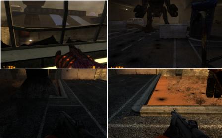
Image 1.jpg
Image 2.jpg
ceiling 1.jpg
ceiling 2.jpg

About the pipe hatch thing I think the reason it seems weird is that you see the soldier close it after throwing in the satchel and it only really makes sense for the smoke/fire to come down the pipe at you if the hatch is closed so it just seems odd to go in right after and see it wide open again. Either way it really doesn’t bother me too much honestly.

I forgot to talk about the sniper. I think the main issue with him is that literally every other sniper in half-life and hl2 is supposed to be (easiest to) killed with a grenade and made extremely easy to do so. Even the other snipers in BM are like this so the average player isn’t going to simply ignore him, they are going to try to kill him. I was thinking maybe you could have him fire down on the ground battle so you notice him earlier. Or put a wall in the window behind him so you can kill him with one shot of the rocket launcher without it going out the back side. I like him being there, he is simply a bit hard to kill. I even shot all of my gluon gun ammo at him once and he didn’t die.

Lastly I agree with ^him the first time I played through I ended up killing that first turret when fighting the soldiers from the car garage window. Maybe move it out of the way a bit, but still somewhere obvious.

The thing is there’s really no need for hidden items. You already have a near full loadout of EVERYTHING because you passed through the armory in C2A5F. By keeping the ammo sparse in these sections, you make it so it’s still semi-important to budget when you get to FaF.

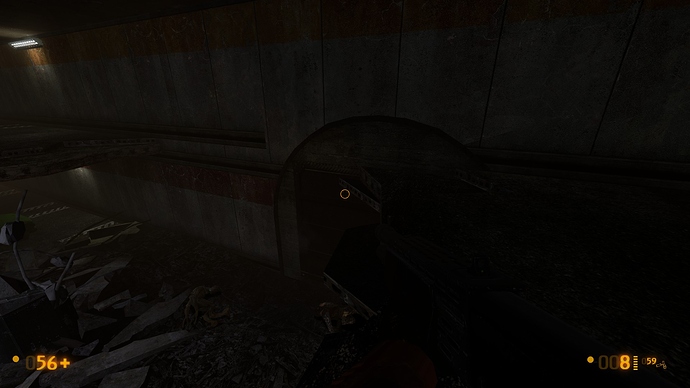
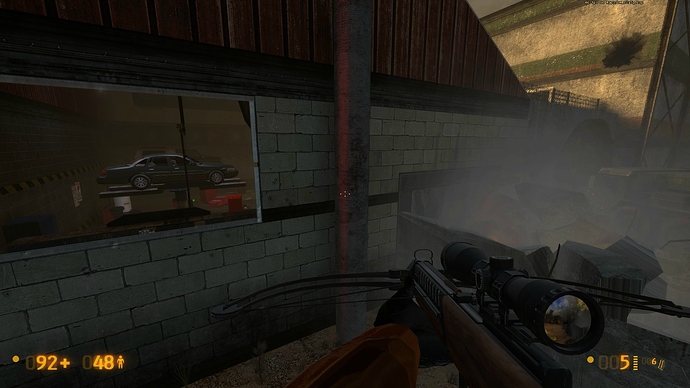
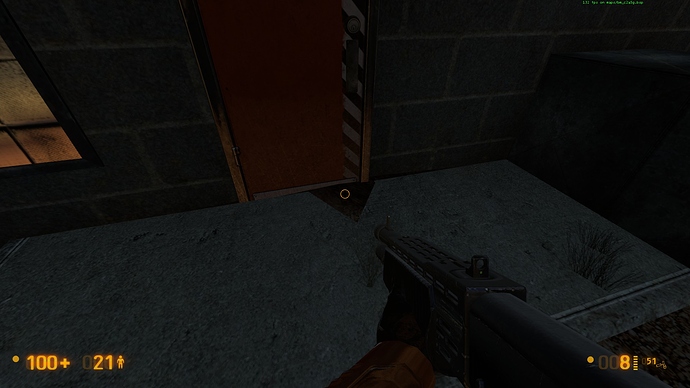
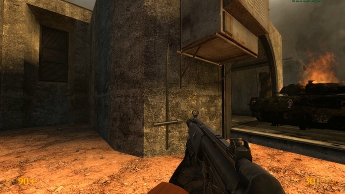
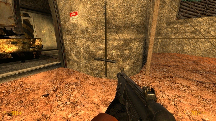
Ok I I played through the fixed version again. No crashes or weapon loss this time, and the clipping I posted a screen of earlier is gone. So I guess I’ll just post some screens of the few remaining cosmetic problems I’ve found.

Right first off is this weird red glow on this support beam.

Next this weird looking triangle in the same area.

This is a minor design decision, that struck me as kinda off. It looks cool but rocks don’t really grow into walls, and you wouldn’t really build a wall onto a rock like that. There’s a couple of them dotted throughout the level.


The freestanding boulders make a lot more sense.

Ok this is what I presume is an unintentional clipping error caused by the door opening into the wall.

Also, after the apc was destroyed (I had to finish it off in this playthrough). The sound of it moving, continued to play from the position of where i’m standing in the screenshot.


The battle would also, look cooler/more realistic if the soldiers used the apc for cover, instead of running wildly into the yard. But I’d imagine that’d be quite hard to do. Really my only gripe with this section is that it’s over so quickly as it’s really very cool! :slight_smile:

Minor clipping error here.

And finally here.

Oh and…

But you already knew that, didn’t you! :wink:

Thank you so much for doing this. You’ve done a great job restoring the narrative of surface tension, that it’s now one of the best areas of the game is an added bonus!

[quote=“Conti”]
About the “exit” signs and the lit lamps above the doors: I don’t know why people are misunderstanding so much these assets with gameplay aspects of the game. There are a lot of them in the game, and plenty of them doesn’t mean that THERE is the place you must go. They are only details to bring more feel and atmosphere to the game.
So, some things that people are complaining here about that subject doesn’t make much sense, IMO. People are confusing so much well-made gameplay with just plain babysitting.

The beauty of Half-Life is that you must think to solve puzzles and find the correct path until beat the game. Of course some cues are necessary, but let’s not exaggerate in this aspect.

This, BIG time!

Repeatedly providing easy and obvious clues as to which path should be taken ruins the exploratory aspect of the game. It’s hand-holding which, in most cases, is not really necessary. What’s the difficulty factor in a small area in determining the correct path if there are two doors each with an illuminated light above each one? You try to open one and if it’s locked you try to open the other one. Simple, no? Is it really necessary to only have the light on above the correct pathing door, even though the doors are a short distance from each other? Now, if there’s a door with an illuminated “EXIT” sign above it and it’s not the correct path, that may present more of a problem. If the player is in a fairly large area, some pathing hints may be appropriate and necessary. Obviously, electronic display panels or control buttons associated with doors should be colored red if locked and green if unlocked. As much as possible, let the player search for the correct path by trial and error, especially when there’s no battle taking place. After all, we’re not doing a speed-run. There’s far more satisfaction in completing a level using your own wits, rather than having what amounts to a green line painted on the ground showing you which way to proceed. There’s no fun or feeling of accomplishment in that.

Alright, let’s go to the biz.


tl;dr version: 1) No bugs or minor details here. 2) Only gameplay feedback with a detail in mind: The player doesn’t need to be babysitted on BM. He must to think and find the solutions on where to go by himself. The whole mod was based on that principle, so your map should follow the same pattern on some areas. Now to save time, you can jump straight to “THE SCREENSHOTS” part.

THE FEEDBACK

First of all, I will not relate here the “aesthetics” bugs because most of them were pointed already, and I’ll wait for a more polished release to see what is changed and what could be improved, and then talk about these minor details (like Ulrik, I’m a perfectionist and checked every corner of the maps). In this feedback, I’ll focus specially in the gameplay aspects, giving suggestions on what can be improved to be more on par (I believe) with the BM standards. You as the map developer probably could not agree with most/any of them – and of course you have the final word on that – but, anyway, these suggestions are my best intentions to improve even more your maps.

These suggestions are tightly related to the “babysitting gameplay” I talked about in a previous post. As an “old school” FPS player, I don’t like the trend created by the “new school” FPS, were the gameplay is mostly linear and the player is guided by hand through the whole game with bling signs and pushed to pre-determined paths… No need for explorations, no puzzles to solve, the player doesn’t need to think and the game almost plays by itself. Really? For me, no fun with a game of this kind. I like to explore, find the path and solve the puzzles.
The feedback you received until now was extremely valuable, but some of them – too much worried about the visual cues on where to go – missed the point and made you push your map to a “new school game” style on some areas.

Thoughts below, with commentaries inside the images (my mockups… never gets old!).

THE SCREENSHOTS

Now the areas which could be improved (C2A5G):

  1. The vortigaunt area in the beginning: The balance is ok, but I think it could differ a little from HL, be more challenging by different spawn points placement and have a surprise factor. More thougths in the screenshots:

https://i.imgur.com/vNTmb.jpg

https://i.imgur.com/B84TS.jpg

  1. The ladder below the vent, after the garage: A ladder below the vent looks like a cheap solution to make the player find his path. Its placement seems too convenient. Maybe a jumping puzzle here could be more efficient than that “buggy” ladder. At this stage of the game, I don’t believe that a player havent yet mastered the crouch-jump trick and a box-below-the-vent puzzle. Unforeseen consequences has a similar puzzle by the way.

https://i.imgur.com/wVWhp.jpg

3) The snark vent, after the ladder: People complained about the darkness in the ladder. Ok, maybe some lighting is needed (I don’t think so), but not too much lighting. What is the purpose of the HEV Flashlight, huh??.

https://i.imgur.com/aW9lc.png

4) The TOW courtyard gate: I think the clean gate was better. Seeing those explosion decals on that door made me think that bombs already exploded there and gave me the impression that door is indestructible (and the intention is totally reverse). No babysitting is needed here… Leave the players to find out by themselves (Oh c’mon! The TOW is already pointed at the door!).

BUT… If you don’t want to change the decals, some thoughts in the image.

https://i.imgur.com/oAupd.jpg

  1. The lights of the red gate below the helipad: Those flashing orange-and-white lights above that gate are nowhere seen in Black Mesa. They look like christmas lights and doesn’t fit good in the place. I think just a subtle and not blinking white lamp above the entrance is sufficient to catch the player’s attention.

https://i.imgur.com/7CxZj.jpg

===

To be continued! Soon I post more thoughts about the other maps.

I can’t imagine how overwhelming all this feedback can be FamGuy, but we’re all proud and amazed by the work you’ve done here!
Here’s my list of most annoying buggies on a casual playthrough (I’m no playtester)

c2a5g
Invisible door from both sides, enemies able to attack you through it, all these blue buttons you encounter are invisible (no model)
Turret didn’t start attacking me until I tried picking it up, either have it destroyed or active
Vort indefinitely attacking the tank, LAV shooting wall on other side of map for no reason, put it further back in the tunnel so it’s more protected and has a clearer shot of everything, including the player
Piece of metal that drains health upon contact,another,and another
Final invisible button of this map
c2a5h
Glass shards look weird, make them reflective or normal glass colour
Blue pipe stands out, make normal grey or white colour
Lower the water effects so it looks like they’re coming out of the pipe
Heat threat in here wasn’t clear to me, add fire
The soldier outside reacts as soon as you crawl out, bad news for players low on health, have the soldier with his back turned or put him on the left passed the wall so the player can surprise attack him
Sign looks out of place, just stamp the picture on the pipe on the left or somewhere near the fire that needs to be turned off
By this point I was begging for a suit charger
Explosive barrels appear black
The steam directly in front has a wide reach and can harm the player when trying to crawl around the corner pipe he’s currently on
Door opening towards the player, same with the door to the room with all the c4, all doors should open away from the player
c2a5i
Other than one or two doors opening towards the player, none
Lastly, some of the wall chargers need to be lowered to the player’s height, and that’s it, the Garg still should take out all the soldiers before chasing the player, but I think that’s a problem for the devs to figure out.

maybe hatch door should blows up too, like safe door in this videohttps://youtu.be/dxgPX5-cmvc?t=4m24s and accidently kills marin?

^this

It seems a good idea. you could copy the placement of those metal crates in Unfor. Cons.

  • no buggy ladder
  • a good ol’ jumping puzzle.

Instead of being opened from if inside(I don’t like it too!), You could create a scripted scene:
After the explosion the hecu opens again that hatch to check if freeman has gone for good this time.
You could place the trigger in the middle of that pipe path, so it would be really easy to see.
I’d use also a clanging sound, so even if the player for some reason look at another direction he will understand that something has happened.
I think it’s a good solution.

About the placement of the hecu in this scripted scene, you could place him behind the hatch, he would shoot at gordon as soon as he sees him or you could leave him in the current posion.

Founded in 2004, Leakfree.org became one of the first online communities dedicated to Valve’s Source engine development. It is more famously known for the formation of Black Mesa: Source under the 'Leakfree Modification Team' handle in September 2004.