OaR - Loop Mod

Concerning the gun rack placement and door mechanics, logical sense is very important in adding believability to an area/environment.

Glad to hear you found a solution for the “no draw” issue above the tunnel wall lights.

Further on the subject of tunnel wall lights, at the time you address the “no draw” issue with them, please confirm that their positioning is correct. Below, issue #32 identifies lights that have positioning issues. Regarding lights that are imbedded/clipped into the wall, I recognize that this is necessary in cases where the tunnel has curvatures in it, in order to conceal the rear cavity/portion of the light fixture, but it should not be necessary to imbed some as much as they are or, at all, in tunnel sections that are veritably straight. Also, these tunnel sections may be existing pre-built assets that you’re using in building your maps, and have these problems incorporated into them already, so it has nothing to do with or is a comment on your quality of work. Whatever the case may be, if it doesn’t cause too much extra work and isn’t difficult, please take the time to correct any instances that you come across during your polishing phases.

Feedback OaR Loop Alpha

  1. Security office air ducts don’t contact the ceiling https://i.imgur.com/ojwTrbp.jpg and https://i.imgur.com/oOuR6gc.jpg
  2. Similar to issue #27, don’t know if these were addressed in your wall texture alignment rework, in the security office https://i.imgur.com/85bOdx8.jpg and https://i.imgur.com/fva2jc4.jpg and https://i.imgur.com/fLT8Dlg.jpg
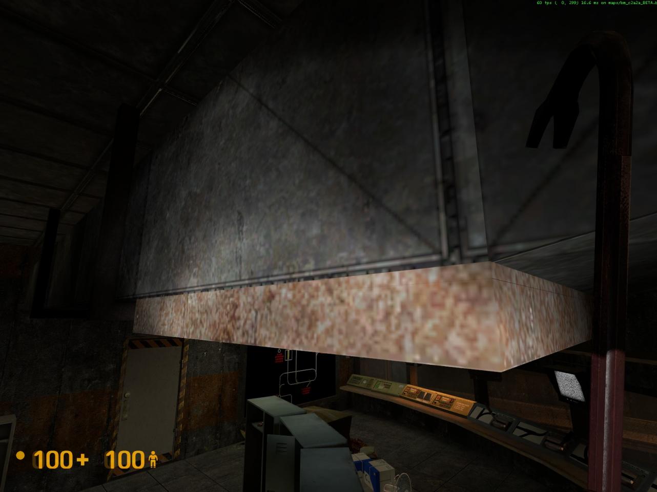
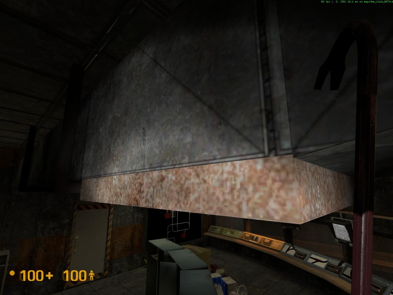
  3. In the security office, both air vents that are attached to the underside of the ceiling ducts, have texture z-fighting issues. On each air vent, it happens on two sides, opposite to each other. See attached pictures 1 and 2 below.
  4. There are several tunnel wall lights, just beyond this area, that have issues https://i.imgur.com/MxqiTCe.jpg. The first two on the right side are not attached to the wall https://i.imgur.com/GyIRSHs.jpg. The first two on the left side are positioned so that they clip into the wall https://i.imgur.com/kh23hfq.jpg. The next light on the left side does not contact the wall https://i.imgur.com/QCKqlrB.jpg. The light directly across from this one is severely imbedded into the wall https://i.imgur.com/yJQJRan.jpg and https://i.imgur.com/Os29AL9.jpg
  5. I suggest adding a tunnel wall light between these two, as there’s quite a distance between them https://i.imgur.com/l7CSmaQ.jpg. It also makes sense to have adequate lighting in the general area where tracks merge.
  6. This may or may not be your work, but the pipe that runs off of this light, is not attached to the wall https://i.imgur.com/5Te1fAS.jpg and https://i.imgur.com/A4M3n9n.jpg
    .
    .

Actually, I’ve found something better. As it turns out, more lights don’t use this nodraw texture than do. By far. Grrrr.

Damn it all, I’m just going to remove the nodraws that are there. I honestly don’t think it will make a lick of difference. And it would save me a couple hundred brush faces. The nail in the coffin is that the transition sections don’t use this method, and I have absolute zero power in altering the look of these places.

This whole thing just grinds my gearbox >.<

  1. Fixed
  2. Got that too. Like I said, the whole office :wink:
  3. I think that’s fixed now.
  4. Fixed. That was the result of how I placed them; I moved lights in pairs so that they would be directly across from each other. These two pairs just happened to be shifted perpendicular to the tunnel, so one is sticking into the wall and one is floating off it.
  5. Fixed
  6. Yes and no. The room was in stock BM but I had to move it further down the hall to accomodate the box track. It… wasn’t the cleanest move either. So, fixed.

Concerning the layout for the security room, please consider the following suggestions:

a) Seems like the fluorescent light above the kitchen counter has a diminished light output, compared to the others in the room. Was this done purposely to enhance the mood? Is this the one you’re going to have arcing, instead of the one above the control panels?
b) The water cooler should be situated next to the kitchen counter or maybe just inside the door to the right, next to the large electronics console. I know you’re reworking the leisure/seating area, so whatever fits your scheme.
c) Relocate the stereo system that’s on the floor in the leisure area, behind the circular table. Sadly, it’s not an asset that we see very often in BM, so make it more visible. Maybe on the far right end of the table that the control switch boxes are on? That’s a fairly empty area right now, but would still be in close hearing proximity to the leisure area.
d) Re-insert one matching pair of the electronics consoles, that you previously had (you had two matching pairs). They seem appropriate in this area/environment. BM has four units in their security room at the electrified water. Next to them, have a pair of the green cabinets, or place a green cabinet at each end of the electronics consoles. On the backside of each green cabinet, place a steel shelf unit, that you mentioned would replace one of the large tables.
e) Place the gun rack on the wall between the door and the large track status display panel, thereby being closer to where the guard(s) would normally be situated/working, for easier access/monitoring. Although this door does not actually open, its operation/mechanics don’t need to be changed/flipped, from a logical sense perspective, to guard against any wandering Joe’s (or Larry’s, Ted’s, Walter’s…).


Further to issue #32, you mentioned that you fixed TWO pairs of lights. Did you catch that I actually reported that there are THREE pairs of lights suffering from this ailment? Just want to make sure that you fix all three pairs.


Feedback OaR Loop Alpha

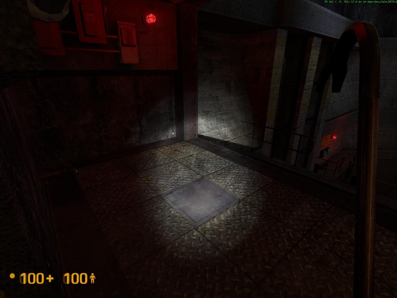
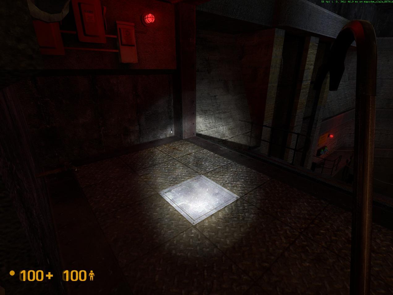
  1. At the electrified water, this maintenance access hatch suddenly glows brighter. See attached pictures 1 and 2 below. Depends on distance from it and the viewing angle, and only when using the flashlight, and if your fingers are crossed. O_o
  2. In the security office, the rear/bottom of the control panel with the mini side-by-side monitors, clips through the table, which can be seen from its underside. No biggie, as it’s obscured. No picture provided.
  3. I know you’re trying to deal with a long (pain in the a**) curvature, but some of the control boxes, in the security office, are clipping into each other and into the window frames, in varying degrees. As far as clipping into each other is concerned, can small gaps be placed between them? I think they would look better. If not easily doable, tweak them as best you can. No pictures provided.
  4. Found these vent cover pieces clipping into this track controller https://i.imgur.com/XRdBvpr.jpg and https://i.imgur.com/39JxsJt.jpg
  5. The backs of two of the monitors in the security office, clip into the walls/window frames https://i.imgur.com/olncCNK.jpg and https://i.imgur.com/OWGPXyC.jpg. Seems like there’s plenty of room to move them forward.
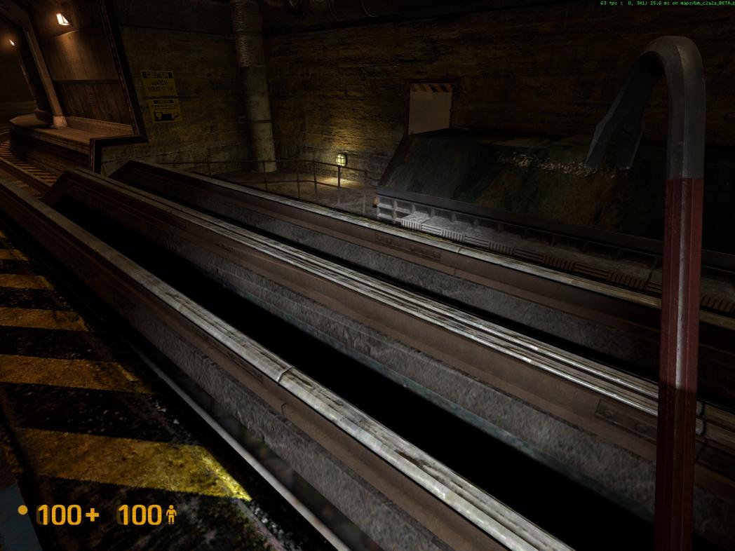
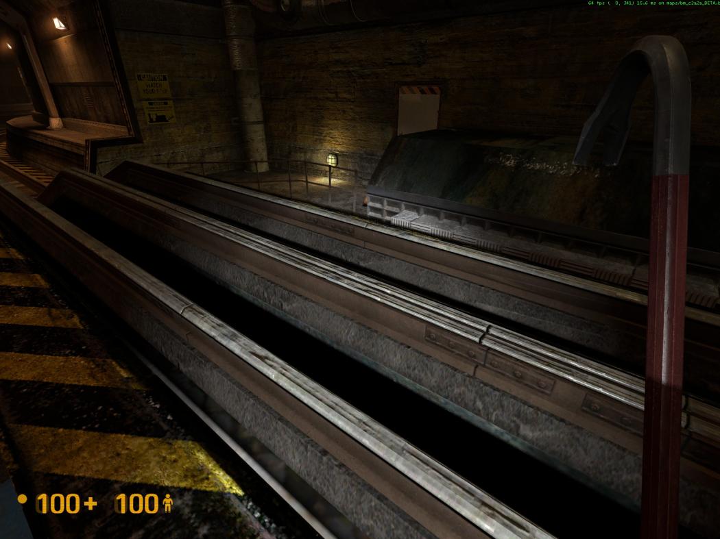
  6. The section of raised tracks, over the water, have nasty texture z-fighting issues. See attached pictures 3 and 4 below.
  7. The red/blue pipes at the raised tracks have texture z-fighting issues https://i.imgur.com/uDBzCUi.jpg and https://i.imgur.com/wyg8zBn.jpg
    .
    .


And now for some news!

Editing has gone pretty well. I’ve gotten quite a few things done. Some small things include:

  • Started the cubemap process.
  • Added in a couple shakes and falling debris, as per Half Life.
  • Added some sounds here and there to make some added rooms feel more alive.
  • Various minor details.

There have been a couple major changes though.

First, I decided to abandon getting the bullsquid to do the scripted scene of shooting at the door.
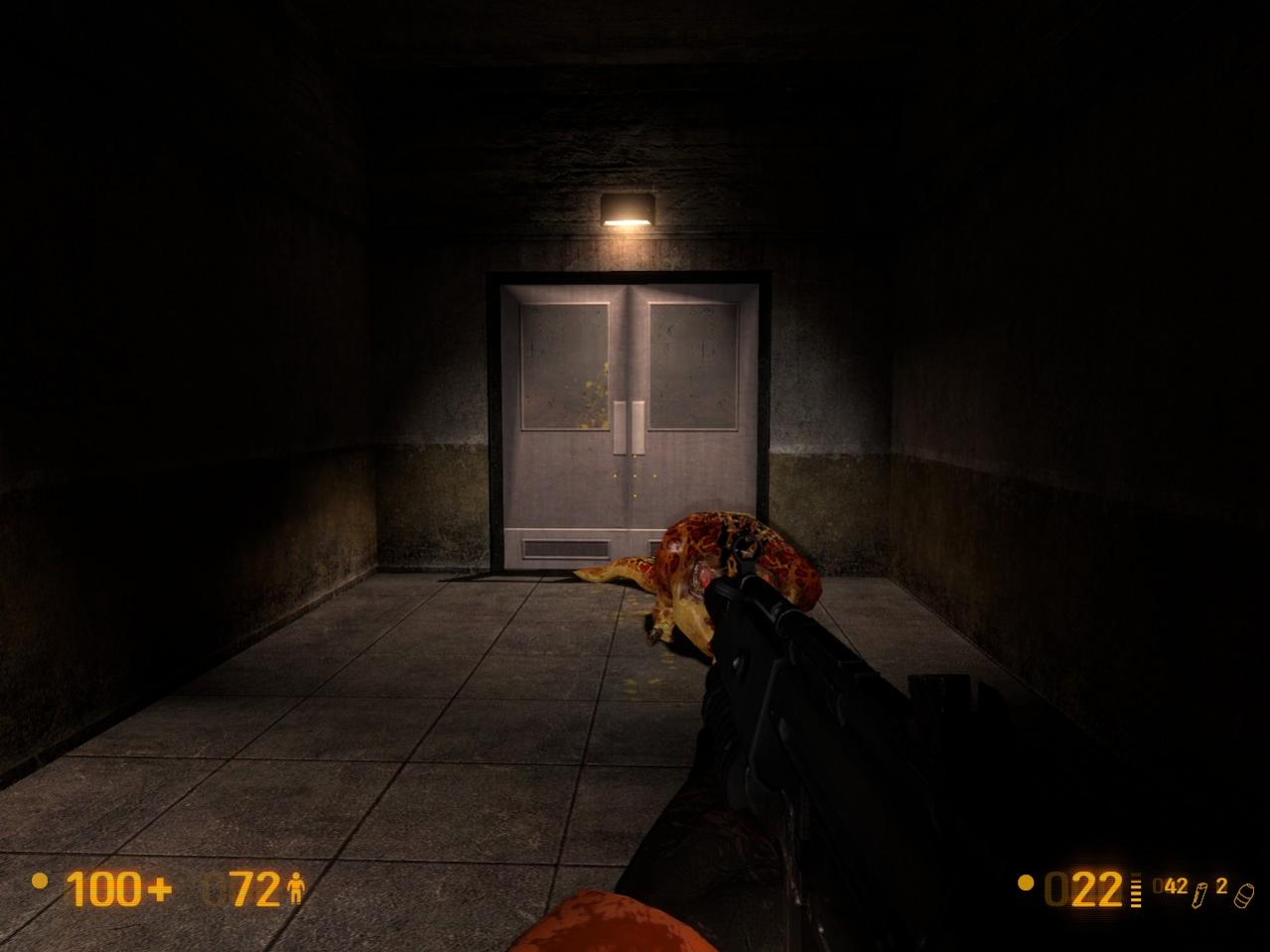
Instead, he is going to be fightable. I decided to actually be a little mean and place him in the elevator hall (which has been widened, btw). So you will have to kill him before you can get into the security office. I think this will bring it much closer to the original elevator hall than I had it before.

Secondly, I’ve decided to make fighting the houndeyes in the security room a lot more dynamic. One of them will spawn as you pass by the window, another will spawn just after killing the bullsquid, and the final one will spawn after killing the first houndeye. The rationale:

  • Having a houndeye spawn while you pass the room would draw attention to the room for the first time.
  • Having a houndeye spawn just after the bullsquid fight would draw attention again, leading the players into the room.
  • Fighting three houndeyes at once in such an enclosed space can turn out badly. Believe me, I figured this out the hard way.
  • It’s no fun to see them destroying an already destroyed room. This way the player can have a chance of seeing it before the houndeyes possibly throw everything all over the place.

Nearly ready for the release candidate but not quite there yet. It might be within the next couple days I reckon, so keep your eyes out for it.

a. The absence of light was intentional, it’s placement was not. In addition to the arching light, there was a light that was strictly not on. It was to add variation. The two have switched now so that the arching light is above the door and the off-light is above the consoles. This might change once more, depending on how things turn out.
b. Done. I kinda had that to begin with and I don’t remember why I moved it really. I’m sure at the time there was a good reason.
c. Great idea! Done.
d. I will probably do this. I kinda didn’t like that there were so many lockers anyways.
e. No can do, and here’s why. The room has three sections to it; the rail section, the lounge, and the actual security section. So putting lounge aside, we have two work areas. However, the area that actually deals with security is in the corner as you enter from either direction. Imagine you’re sitting at the console station and you need to respond to a threat across the hall? And what if you were sitting in the lounge? What if the door was open? Where it is now is the best place for it.The rail operation section is secondary to the security section, to put it simply.
That, and it blocks NPC navigation. The houndeyes wouldn’t be able to go through there because there wouldn’t be enough space.

  1. Yup, got it. Thanks.

  2. I don’t know why it does that, nor can anything be done about it.

  3. Ew, that’s a big deal to me though. Removed.

  4. I’ve tweaked it just a bit but unfortuantely it can’t change much. It’s kinda frustrating that the console lengths match up perfectly with the walls lengths. :frowning:

  5. Interesting?

  6. Fixed.

  7. I’ve fixed it some. Actually, if I recall, you might have brought this up already.

  8. It’s not supposed to do that. It might have been a compile error. I just don’t know. I’ll probably fix it before the final. I recall mentioning in the past that these props have given me headaches before…

Glad to hear about your rework/addressing encounter issues with various enemies. It’s very important to get these right, scripted or not, in order to portray a believable/consistent battle experience.

It’s so refreshing (ice-cold water spray on my face) to see that an obscure “no biggie” issue to me (issue #36) is so important to you (WOW), that you want to remove it. I’m with ya’, take care of it bro’, throw me a dry towel, when you have a moment (preferably something that you haven’t already used to temporarily dry your cat/dog/other pet).

Looking forward to your Release Candidate #1 release. I’ll jump on it, for feedback, as quickly as I can. Just take your TIME, as you’re under no pressure to release anything to the community before you’re ready. A day or two delay really has no negative bearing on your release schedule. Remember, it reflects better on you if your releases are as polished as much as they can be. Don’t fall into the easy trap of thinking that releasing incomplete material frequently is better than releasing material that reflects marked improvements. There are those that are driven more by frequency of releases instead of quality of releases. The defining moment is when the work represents you in the BEST light.

Further to issue #32 - Thanks, this kind of acknowledgement is always very IMPORTANT to feedbackers, for a sleepful nights rest! Zzz…

Further to issue #38 - I think these vent cover pieces were inside a wooden crate, in the area, that I broke open.

Further to issue #40 - Apologies if I reported this issue to you earlier. I thought it was elsewhere. Better it be addressed, than not.

Further to issue #41 - Try Extra Strength Tylenol? This does not provide immediate pain relief, but does help with long-term discomfort.

Just wanted to take my time to say that your always respectful (reiteration of issue #32, “Yup, got it. Thanks”), plain, succinct and common-sense, level-headed acceptance/attitude/[COLOR=‘Orange’]HONESTY/patience/positive (alphabetical) reaction towards community feedback/suggestions is HIGHLY appreciated. Some mod Devs are hesitant in admitting their lack of abilities, inadequacies and shortcomings. Don’t EVER loose that attitude/mentality, as it will take you far and easily extract someones unsolicited positive support. Your caring, respectful and your positive feedback remarks (concerning security room suggested improvements issue #c, “Great idea! Done”), easily puts one in a positive and productive state of mind in helping someone who’s giving their free time and efforts unselfishly towards a community betterment mod, as you are, while not sacrificing there basic design goals. You’re doing a [COLOR=‘Lime’]SUPER job, .RK.

I look forward to further assisting you in attaining/reaching the final vision and realization of YOUR Loop Mod, and ANY of your future endeavors. Let me know what they are and I’m gladly there for ya’, 110%! (provided I have the base game).

You have no idea how much of a smile that put on my face. I do try my very best, and it’s great to see that I’ve done this much right. :smiley:

And now a couple things:
I might do a little cosmic retcon here. The beta I released is now the alpha. What comes next is the beta (albeit a very polished one), and then release candidate, and then the final. The reason for this is that previously the release candidate was next, but having something like that would have meant me locking in a design (because I couldn’t alter much before the final). I think this slight change of terminology will help just a bit. At least, it will for me anyways~

The bullsquid isn’t working in its new location either. Placing such a big guy in the same space as a bunch of barnacles can cause weird stuff to happen. Plus it doesn’t play as well as I had hoped it would. So to solve this I think I’ve reached a compromise that offers the best of all worlds.
I am placing the bullsquid back into the side hall, but since I have the capability of opening that area up now (I’m sitting in a comfortable spot in terms of brushsides), he will still be fightable. Having more area to hide behind will surely help with fighting this guy, something you couldn’t do when fighting him from the tram.
This will also allow me to slightly alter the look of the main hall (where the elevator is at) because I’ve grown not to like how it’s set up.

I know ya’ll are probably itching to get into the mod, but with a little bit of time I’ll have something even better to give you all :slight_smile:

Then it served its purpose!

The next release is still beta right?

Yes. This is the beta. The actual beta~

[COLOR=‘Red’]LOOP MOD BETA IS NOW LIVE[/size]
Not to be confused with the previous Beta, that was an Alpha.[/size]

You can find it here: https://www.dropbox.com/s/q8ik53e37wgefxt/LoopMod.zip[/SIZE]

AS ALWAYS, LET ME KNOW STRAIGHT AWAY IF THERE ARE ANY MISSING TEXTURES OR MODELS.

So here we are again, it’s always such a pleasure. Here is the next iteration of Loop Mod. I think I’ve fixed a great many mistakes since the Alpha, and it’s in much better shape than it was before. I probably could have fixed more, but at the moment there’s quite a bit going on and I’m a bit sick of it at this moment. Don’t worry, I will perfect the mod in the coming week, but I need a break. :slight_smile:

Be sure to read the README, as it contains important installation instructions. They are slightly reworded (hopefully to make it easier to distinguish between map versions). If you complain about the mod not working and it’s obvious you haven’t read the note, I will not help you.

Take note of the known issues list as well. Contrary to last time, I will be completely fine with anyone bringing up issues that are on the list. I think it will help me make a more comprehensive schedule for fixes as I go along. And if you have solutions for any of the items listed, please let me know!

Played through the proper Beta. Super job .RK! The shake, rumble and falling debris was cool. Also, glad to see you fixed the “no draw” issues with the tunnel wall lights. Still, the map has some issues, that I know you’re working hard on to fix. Most notably, the tunnel support frames still have a chrome look to them. Also, the red and blue pipes still exhibit texture z-fighting issues on their connection collars. In any event, that’s part of the development of a mod. Hopefully, you’ll find easy solutions to these, and the remaining issues.

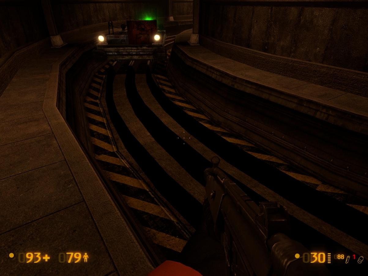
For the darkened eerie area you wanted in front of this blast door, just past the security office https://i.imgur.com/UIvSBQZ.jpg, both wall lights that you moved there are functioning. Did you try one burnt out and one slowly flickering, like I suggested, to try and get the lighting look/mood that you were initially after? Did it not look good?

Concerning the security room and outside hallway, although it looks better, I’d like to suggest the following:
a) The elevator looked better when in was centered in the hallway.
b) Remove the large table from the security room. Put the computer that was on it on the right end of the counter, between the track consoles and the stereo. This is where a guard would typically be working, looking out through the windows, within easy view of the large track status display board, and easy/quick access to the track control consoles. Put the fan that was on the table, on top of the stereo, and make sure it’s turned on.
c) Place a cabinet (preferably ones that are different and taller than the “open” green type that you’re now using) at each end of the data tape machines. Maybe try a couple of the five-drawer beige lateral filing cabinets to see how they look.
d) On the backside of these, place your two steel shelf units, with supplies on them.
e) In the outside hallway, place the table that you removed from the security office, across the front of the elevator, like a barricade. Smear some blood on the floor and put a dead guard or scientist behind it. Or, this can be done in the new hallway you opened up, in front of the double doors at the end of it.

Feedback For OaR Loop BETA

  1. This wall vent https://i.imgur.com/kK6wQFm.jpg is not flush with the wall https://i.imgur.com/LG9zoNB.jpg
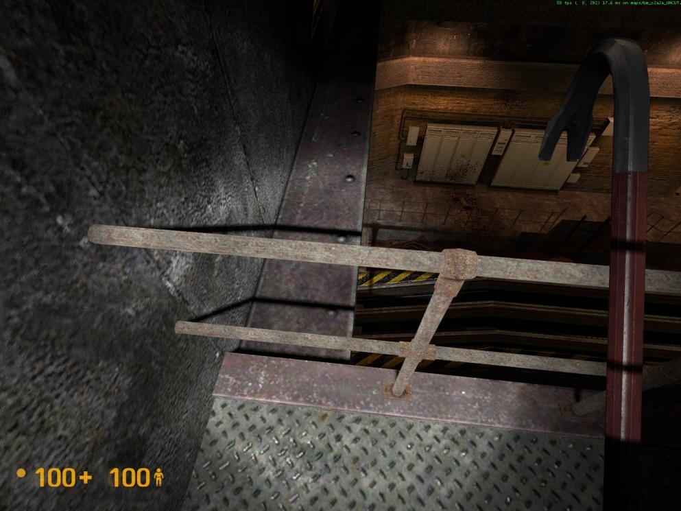
  2. On the walkway above the raised track, these handrails, upper and lower, have texture z-fighting issues. See attached pictures 1 and 2 below.
  3. These tracks, outside the security office, are too dark https://i.imgur.com/eJQtgwq.jpg and https://i.imgur.com/rxoLofn.jpg
  4. These two doors should have the faces on them that display hardware, like a knob and key-lock https://i.imgur.com/qrxdd4s.jpg
  5. Incorrect shadow in front of these double doors https://i.imgur.com/U2LXd4m.jpg
  6. Also, weird shadows below these lights https://i.imgur.com/5bwMpOS.jpg and https://i.imgur.com/98B29B7.jpg
  7. The arc from the sparking fluorescent light in the security office originates too far away from it https://i.imgur.com/dao2tFf.jpg. Also, the arc should come from where the tube terminals are situated, at the ends of the fixture (not the very end, but just before).
  8. This coffee cup is floating above the electronics console https://i.imgur.com/5Pz4QNC.jpg
  9. The area where the track switch control consoles are is too dark https://i.imgur.com/bp5auSm.jpg
  10. Can this shadow on the counter be removed? https://i.imgur.com/GSZq6ii.jpg
  11. In the tunnel, outside the security office, that leads to the blast door https://i.imgur.com/RBvzMzK.jpg, this light is floating in mid air https://i.imgur.com/gEHMstB.jpg
  12. In the same area as item #11, continuing farther along this track, the next light clips into the wall https://i.imgur.com/6tBa6Tr.jpg and https://i.imgur.com/7heeM2S.jpg
  13. Just past the security office, there’s another merging tunnel, here https://i.imgur.com/gimqF8K.jpg. Near the blast door, this light https://i.imgur.com/7Mii0yI.jpg, clips into the wall https://i.imgur.com/gIxlRuo.jpg
  14. Consider using some fluorescent lights in this newly accessible hallway https://i.imgur.com/CcKHu9D.jpg. It may get rid of some of the weird shadows. If you do, remove the one wall light that’s not over a door, namely, this one https://i.imgur.com/xZOs22i.jpg
  15. Can you better align these floor texture seams, so that they match better. Leaving the security office towards the hallway https://i.imgur.com/fY9VSW1.jpg and from the security office hallway, to the tunnel https://i.imgur.com/ZDrxvy8.jpg
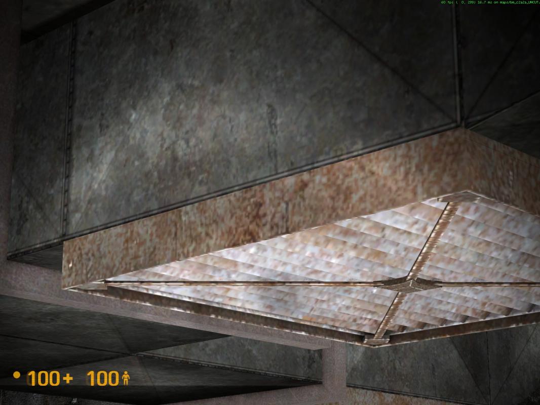
  16. The texture z-fighting issues with the two air vents, that are mounted on the underside of the ceiling ducts https://i.imgur.com/Qh8KIgd.jpg, are still apparent. It happens on the opposite side as well. See attached pictures 3 and 4 below.
  17. This wall light https://i.imgur.com/qT45h6M.jpg, clips into the underside of the steel wall trim https://i.imgur.com/HuyVPEv.jpg
  18. Past the security office, the tracks decline and you reach this junction https://i.imgur.com/QGEpytR.jpg. Proceeding straight ahead, the third light on the left, found here https://i.imgur.com/XbGyiDT.jpg, does not contact the wall https://i.imgur.com/UCZrdJ0.jpg
  19. Past the floating light mentioned in item #18, you reach this junction https://i.imgur.com/tvApBoR.jpg. The light on the left of the blast door https://i.imgur.com/oC7wmwz.jpg, clips into the wall https://i.imgur.com/mISIIRG.jpg
  20. Looking away from the blast door, mentioned in item #19, there’s a wall texture seam issue, here https://i.imgur.com/VeXgEcp.jpg and https://i.imgur.com/srCahYU.jpg
  21. At the start of your new tunnel https://i.imgur.com/Hgx19J7.jpg, the tracks have texture z-fighting issues https://i.imgur.com/jZwIoiX.jpg and https://i.imgur.com/BW7IkUI.jpg
  22. Just past the raised tracks over the water https://i.imgur.com/rdMtYZc.jpg, the first light on the left https://i.imgur.com/t6HUa6n.jpg clips into the wall https://i.imgur.com/PGHuIZd.jpg
  23. Consider placing two wall lights (across from each other), at the start of your new tunnel, as it’s overly dark there https://i.imgur.com/tbVGiLk.jpg
  24. At the start of your new tunnel, the first light on the right https://i.imgur.com/2klURfG.jpg needs TO BE CLIPPED into the wall, as the rear of it is exposed https://i.imgur.com/j5soZud.jpg. On the other hand, the light directly across from it https://i.imgur.com/QX6eTxD.jpg is clipping into the wall https://i.imgur.com/Djt4htZ.jpg. The exact same issues exist with the next set of lights that are directly across from each other, pictured here https://i.imgur.com/cyeAcMA.jpg. The one on the right needs to be clipped into the wall and the one on the left, is clipping into the wall.
  25. Similar to item #24, the next light on the left side, shown here https://i.imgur.com/Ct3s20u.jpg is also clipping into the wall https://i.imgur.com/eQePCfb.jpg. However, the one directly across from it is fine.
  26. Outside the security office, consider using the raised cladding on three sides of this support column https://i.imgur.com/PpyHw62.jpg, to match other similar ones in OaR.
  27. On the outside wall of the security office, this light https://i.imgur.com/G0DEfGa.jpg clips into the wall https://i.imgur.com/uuK2gi1.jpg
  28. On the outside wall of the security office, there’s a texture seam issue here https://i.imgur.com/eTZ6byh.jpg and https://i.imgur.com/DhBbkjf.jpg
  29. For design consistency, consider placing a light directly across from the one pictured here on the left https://i.imgur.com/RtLqEds.jpg at the appropriate location here https://i.imgur.com/zEMljga.jpg. It’s your call if it’s illuminated or not.
  30. This arcing fluorescent light https://i.imgur.com/lE2BAaw.jpg should be moved slightly to the left, and anchored onto the ceiling tiles framework, so that it’s position is aligned with the ones on either side of it https://i.imgur.com/wh2C8mA.jpg. Also, it should be centered between the left and right one. Right now, it’s skewed more towards the right one https://i.imgur.com/lkQO28n.jpg
  31. Consider moving these fluorescent lights to the right, and anchoring them onto the ceiling tiles framework, thereby centering them between the wall and the ceiling air duct https://i.imgur.com/exCJZDT.jpg
  32. Consider placing a light between these two existing ones https://i.imgur.com/SwgF5ue.jpg, for better signage illumination, and to assist the guards that would normally be monitoring/viewing this area through the windows https://i.imgur.com/vR99ujM.jpg

[COLOR=‘Orange’]Conclusion Of Feedback For OaR Loop BETA
.
.


Just played your beta awesome job, love what you’ve been doing.

  1. These double doors lead to nowhere they just have a cliff wall behind them.
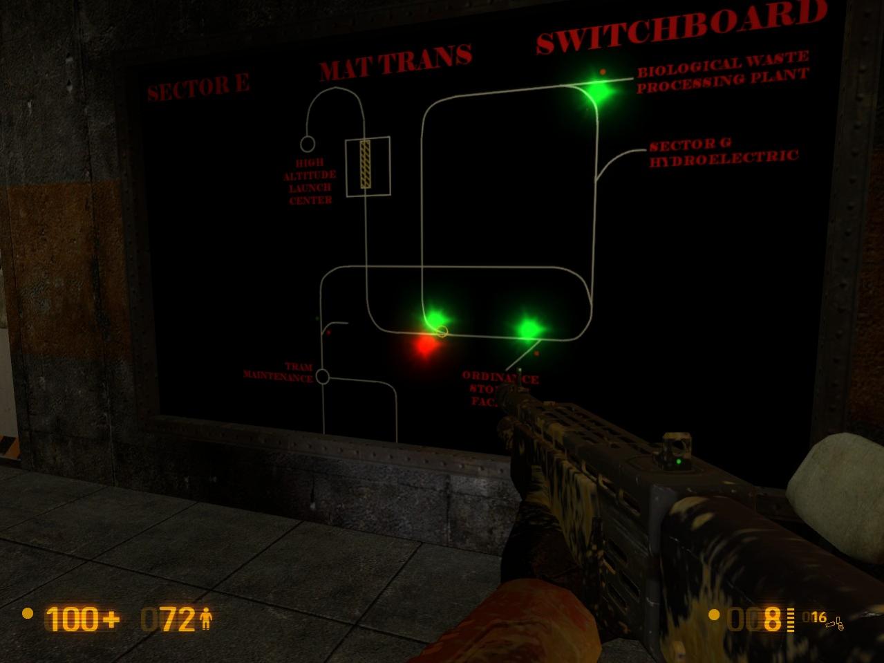
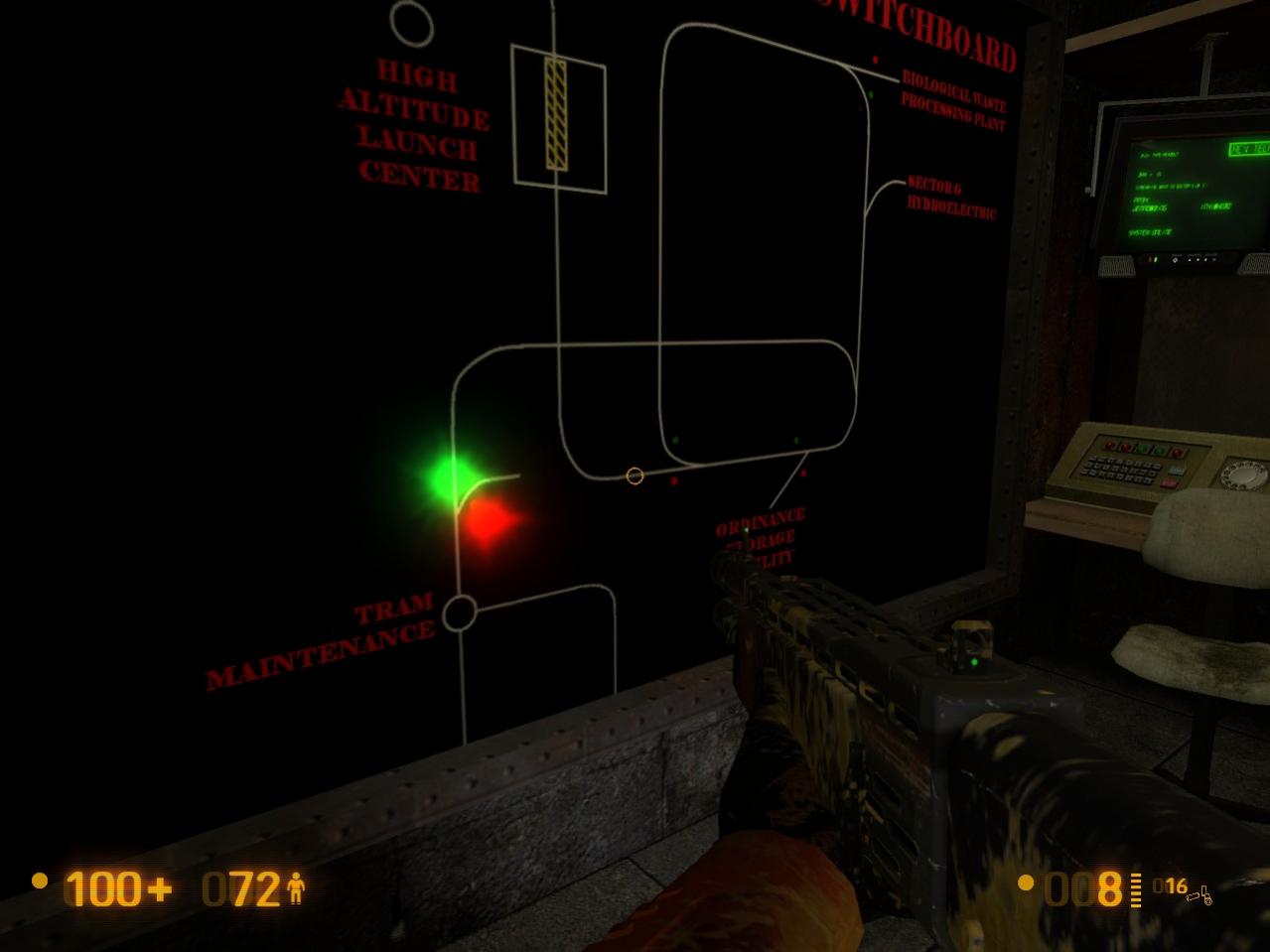
    2.The control room switch board doesn’t display the lights properly, as you move some disappear while others reappear(yes I know they are blinking as well).
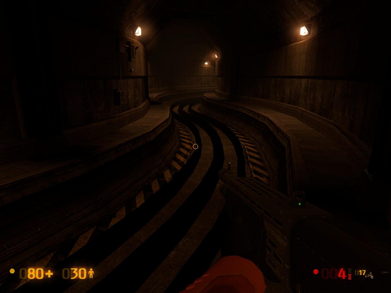
  2. Many of the segments of tracks through out the level are blacked out. All only on bends and at the end.
  3. while I have no picture, after you switch the track and pass the 2 vorts at the junction, that whole section of track; if you stop the train on it,you wont be able to start it again until after you do the lowering the bridge puzzle.


Hey guys! I’ve been quiet the past couple days. Real life managed to snag me so I haven’t really been able to get on this as fast as I have.

Rest assured, I’m currently working through the lists, and I’ll post again once I can completely reply to the both of you. Thanks for being patient!

Love this little level expansion. It’s great to have a bit of concentrated puzzle solving in the middle of the game. Just have a couple of ideas localized around the same spot on the level, which is where you go to change the tracks.

  1. The rail map in the control office looks really pristine compared to the rest of the environment. The map itself is great, but I think it’d look more at home with a little decay, just dirty it up by overlaying some image like this… https://is.gd/UgAeux I think having a glass front to the map would be a nice touch, too. Could even make it one of those breakable glass panels.

  2. I was disappointed there wasn’t much down the dark bullsquid tunnel across from the rail switching controls. Some ammo, a flickering light or even a motivational/instructional poster on the wall, anything would make that corridor a bit more interesting. I turned on the flashlight and it wasn’t very obvious, but there were rocks on the other side of the door at the end. Maybe it would be cooler to have had a rock slide there sometime in the past, like the roof has caved in and there’s hazard signs in front of it.

But still, this is a pretty great addon. Good work.

Thanks a bunch for the feedback everyone! I am very glad you guys are enjoying the mod, because it certainly gives me the drive to keep improving it. I’m finally had a window where I could work through all of the suggestions (at least to a point where I could address all of them accordingly).

And please don’t be scared about leaving them. I usually take the time to reply to all of them and in doing so it really helps me know what I’ve done and what I haven’t.

Just a bit of note first; I’ve had a couple comments about some tracks not being properly lit. Do bear in mind that I have still not completely done an info_lighting pass, so that’s why. This is something that needs to be done with static props and it’s not something I’m terribly comfortable with. It will be done by next release though.

On to replies!

  1. I agree, a little decay on the board would be pretty nice. Not too sure about implementing glass at the moment but it would probably make sense. I’m sure there’s a texture somewhere that I could use for it.
  2. That’s also something I want to work on. I realized it was lacking when I released the beta but it wasn’t something I wanted to get into at the time. Having an actual collapsed corridor is a great idea though. Would have to for exactly how they might cordon off such an area first.
  1. Not that there’s anything wrong with that. But I’ll probably expand that a little once I get the chance.
  2. I have no idea why those are doing that. They’re supposed to be sprites and should always be facing the player. I copy/pasted those from the bridge control room, so they should work fine.
  3. Addressed.
  4. Yeah, this whole section is weird. I’m currently trying to work that out, but it’s possible that’s there by default. I could probably talk about some of the weird shit I’ve gotten so far trying to fix it, but I won’t. xD

It’s not pretty, I agree. What I might end up doing is just using brushes there. Not the most consistent solution but it would give the job done. I’m sure I’ve allowed myself enough of a buffer to add about 100 brushsides.

Eh, I’ve abandoned it. I’m kinda meh on that now.

a) You’re absolutely right. I don’t really know why I liked it like that
b) I think the moving of the stuff makes sense. As for the fan being turned on, I’m not all that sure about that. Physics props can’t be animated and I intend for it to be a physics prop. So I can either have it throwable by houndeye blasts or I can have it on. Can’t have both, unfortunately.
c) Will consider.
d) Will consider.
e) I can probably tell you upfront that whatever is being placed outside the office will be placed in the new hall. The elevator has to remain as is (elevator / military boxes / barnacles) so that it can maintain the HL1 layout.

  1. Fixed
  2. Minimized/fixed. It helps that I can hide most of my extensions within the wall.
  3. Addressed.
  4. Fixed
    5 & 6. UGH. I have no idea why these lights are doing this. It’s just weird, especially considering that I pretty much copy/paste all of these lights. They are the exact same setup so I don’t know why it’s happening on some and not on others. :frowning:
  5. Fixed
  6. That is what happens when you accidentally set physics props to start asleep. Fixed.
  7. Those panels are being illuminated by the tunnel light just outside. If it’s really important (which I could see why it would be to have those illuminated instead really), then I’ll fiddle with the tunnel lights in that corner so they bleed onto our rail panels instead.
  8. That shadow is being caused by the houndeye underneath. Nothing I can do about it.
  9. Fixed
  10. Fixed
  11. Fixed
  12. I’m definitely going to do that. It would go some ways as to decorating the side hall. At the same time though, I don’t think deleting that one light will be necessary, and if anything I should add one just like it nearby.
  13. If I aligned the floor textures, then the tiles wouldn’t be flush with the wall.
  14. Fixed, for real this time.
  15. That’s a surefire copy/paste from how the devs did those lights. This little issue doesn’t seem like a very big deal, so I will see about doing something about it.
  16. Not mine, but can change. So, fixed.
  17. Fixed.
  18. Yowch! That’s a biggie. Fixed. That one definitely stems from how I made this track. What I should have done was made a regular tunnel and then turned the whole thing as a unit by 45 degrees. Instead, I made all the parts individually. Thankfully it turned out pretty alright, but what you see here is a somewhat predicted result.
  19. I actually somewhat managed to fix this. It involved moving the entire loop about 5 or 6 units up (which is actually easier than it sounds) so this and some other issue that was on the other side have been fixed/minimalized.
  20. Fixed
  21. Done.
  22. I actually took this tunnel from just after the bridge, so the problem exists there as well. I could either solve them fully with a little geometry additions or could reposition them slightly so that they don’t fall on a wall seam. I’m leaning towards the latter myself.
  23. Fixed
  24. Normally yes. However, there are two reasons why I can’t do this. One is that it would make placing the track switch difficult, as it is meant to be placed on a flat surface. Two is that the default pillar (you will find it at track switch three, right next to the vort ambush and the flickering electrical box room) has the same look, so it is consistent in that regard.
  25. Fixed
  26. That one’s so small enough that not only could I avoid having to fix it, but I probably am unable to fix it. That curve was extremely difficult to make because of the geometry I had to figure out there. But I’ve done my very best to get things within .01 of a hammer unit.
  27. Normally yes. But again, the style is slightly different at the electric pool puzzle counterpart (you’ll recall me bringing this up with the raised cladding issue). There was no light on that, so I will not be adding one here either.
  28. Fixed.
  29. Woops. Meant to do that from the beginning. Fixed.
  30. That sounds plausible. Will have to keep in mind what’s going on with issue 9 though.

Thanks ever so much for your detailed response.

Concerning giving up on the darkened tunnel at the blast door, what are you, NUTS! You had a great concept, so don’t give up on your vision so easily. I say put it in, as I think it would look really cool. It doesn’t exist in any other part of OaR, so it’s an exclusive look/effect. Absolutely reconsider pursuing this. I think it would be a great visual effect/lighting mood! Is there another reason, based on limitations, that you don’t want to do this? If not, DO IT? In map making, uniqueness is something that you want to pursue at all times, especially when it fits seamlessly into the mod’s basic design parameters.

Concerning item #26, I recognize that the track switch light assembly needs a flat wall to be mounted onto. That’s why I suggested “consider using the raised cladding on three sides of this support column”, not four sides. You mentioned that there’s another reason as to why this can’t be done, so that’s fine. Besides being consistent within a mod, there also needs to be consistency regarding the principle base material.

So on one playthrough I noticed there’s a blue crate sitting at the bottom of the stares where you encounter the first Bullsquid. It doesn’t make sense for it to be there, because something that heavy would need some sort of lift, and there’s no access for wheeled carts or vehicles, just stairs.

Hi .RK. I played through your A map loop mod and I thought you expanded the map very nicely. I will give some feedback on it soon.

Here’s a quick update: I’ve made some improvements to the design and so far I am pretty happy with them. I’ve also been able to address a couple of issues.

  • The weird lights in the hallways are now fixed. In fact, the look of the place is different because I replaced those office lights with something much more appropriate.
  • The houndeye spawning system had a flaw; refraining from killing the bullsquid kept one of the houndeyes from spawning. I don’t want that.

Also I’ve given some serious attention to the side hall now. I won’t show ya’ll just yet but at the stage it’s at right now, it looks pretty fantastic. I am sure you will all love it.

Now, I’ve also been able to locate a fairly serious issue that I am not sure what to do about.


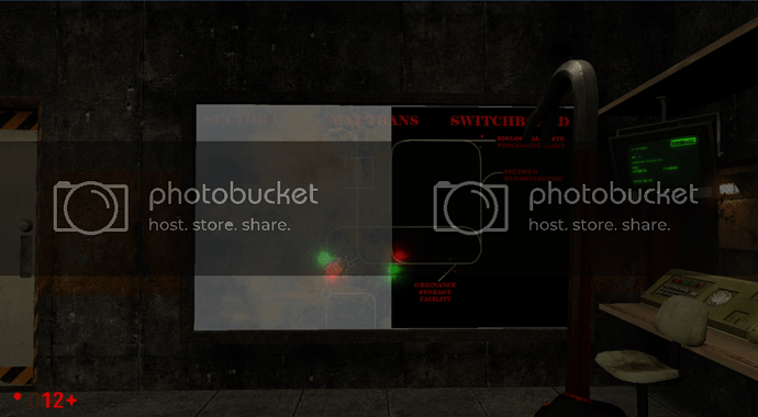
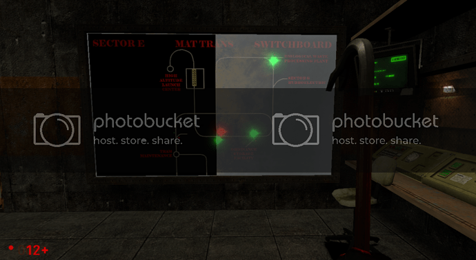
As you can see, this switchboard does not like to behave when viewed behind glass. It’s never been more apparent that it is in this picture. I really don’t know what causes this to happen, and I really don’t know if it is a problem I will be able to stand being present in the final. Right now it’s a func_brush and uses a env_texturetoggle entity to change it’s appearance.

So if anyone has any tips on how to fix this, I would surely love to have them right now. I’m looking at you mappers out there especially.

I know exactly the box you’re talking about. And unfortunately I just gotta shrug at that one. That’s dev stuff.

Took your advice and decided to give it another go. And you’re right. And it looks pretty awesome.

Oh dear. I’m afraid I know nothing about why it’s bugging out.
However, upon actually seeing my idea implemented, it’s freaking huge.


Something like this, but maybe twice or three times the size is more what I had envisioned.
Also, that first branch after the “Tram Maintenance” area doesn’t go anywhere.

Error in posting. See my next post!

Founded in 2004, Leakfree.org became one of the first online communities dedicated to Valve’s Source engine development. It is more famously known for the formation of Black Mesa: Source under the 'Leakfree Modification Team' handle in September 2004.