DM_Outpost

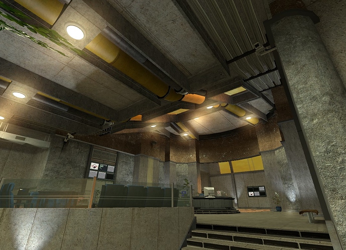
Map is looking very nice, but as Adam said, I would definitely take some cues from how BMS does the lighting. Your lighting is almost exclusively yellow fills and it looks quite unappealing and bland in places. Try and find a colour scheme which complements the world textures and creates a certain mood - and also use some highlight lights to throw in a bit of contrast and draw attention to important places. Contrast is tricky to do in MP as you never want to make it impossible to see, but there’s a delicate and difficult balance to be struck.

Also, your criticism of Gasworks makes me like the map 100% less. UNACCEPTABLE!

@Adam-Bomb @TextFAMGUY1

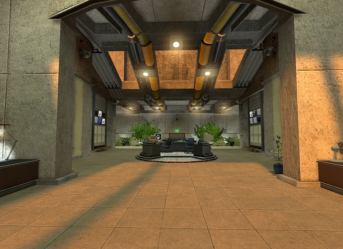
Thanks for the feedback you guys. I agree with what you’re saying about all the lighting. A lot of work has been done to the lobby since those pics, and I was actually going to post some more pics today.


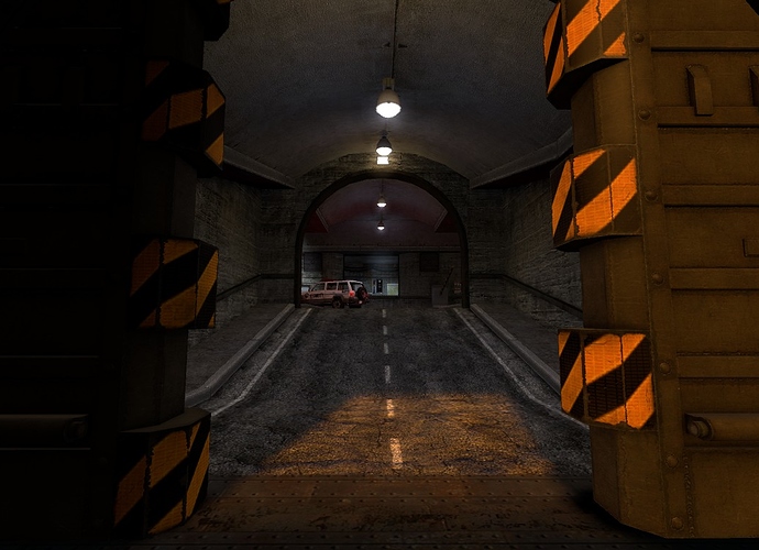
Changed the top wall, and opened up that big door down there.


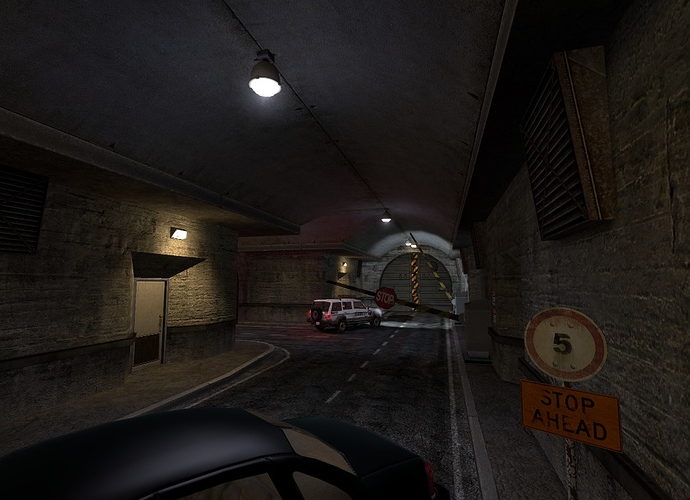
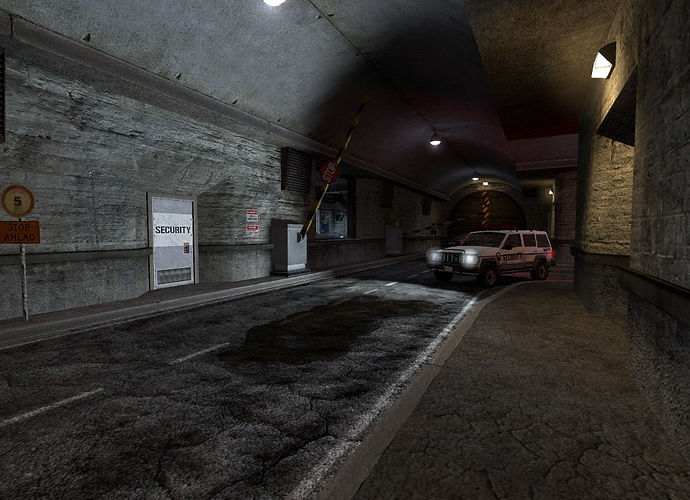
Security checkpoint.


This area doesn’t actually go anywhere yet.


Pipes! Wires! Vents! Television screens! Still yellowish lighting!


Still working on the whole lighting thing.


The vent on the back wall goes down to the floor below.


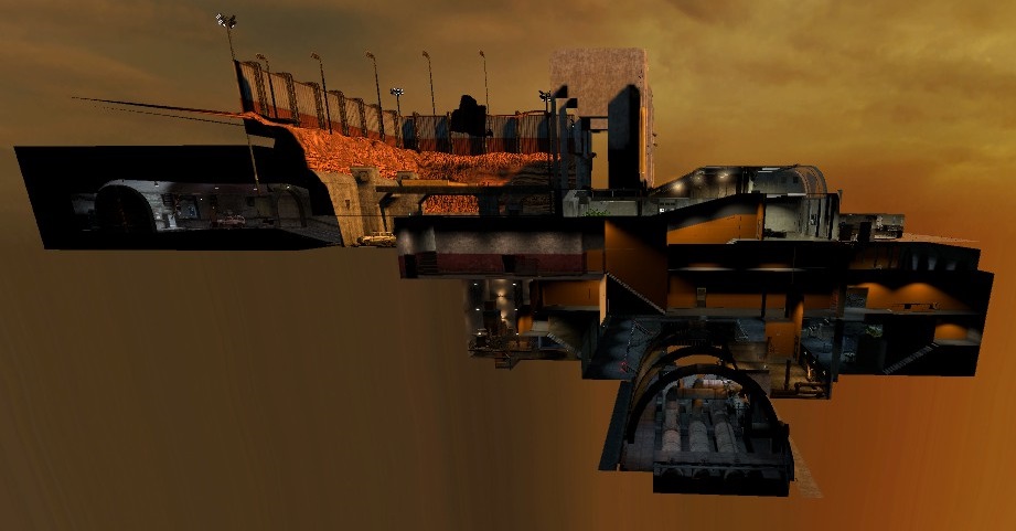
A side view of the entire map, so you can sort of get an idea of the layout of things. Top down view doesn’t show much except the first floor.
If anyone is interested in the entire layout, I can maybe draw up the floor plans or do a video or something in the future.

This is amazing. I am, overall, very impressed, but there’s a few things you may want to consider changing:

  1. The outer wall in the first picture looks very obviously square, you may want to random it up a bit.
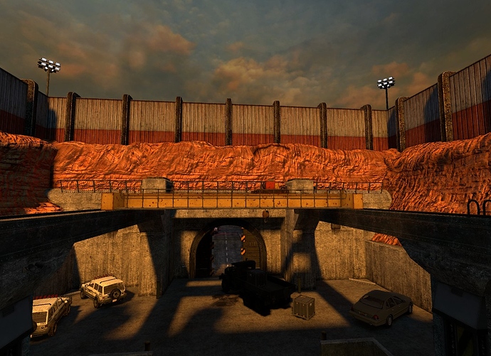
  2. In the third picture, the concrete in the square overhang on the side of the arch appears to end very abruptly. I’d suggest putting some kind of border for it, or at least a different texture.
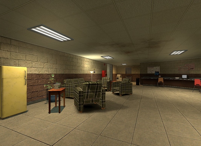
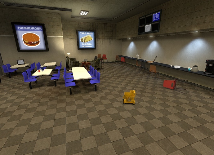
  3. That break room still looks extremely unfinished… not really sure what to do with it, though…
  1. You mean the rock itself is too square, or the big red and white wall on top of it? Or just the entire outside area?

  2. Not too sure what you mean here either. Sorry. I did copy this design straight from the main game for consistency’s sake, so that’s the same way it is in the actual game, unless I missed something.

  3. I don’t know either. Maybe some carpet or something?

  1. Both, really. I’d suggest looking at the canyon walls in Inbound to see how they kind of wobble and curve.
  2. Huh. Well, maybe it just stands out because of the screenshot perspective.
  3. I feel like the two big problems are the uninterrupted expanse of brick wall, and the uninterrupted tiles of the ceiling. I’d mess around with detail brushes in this area, or maybe even completely redesign it into a proper cafeteria.

You know, I may just make it into a full-size cafeteria. I like that.

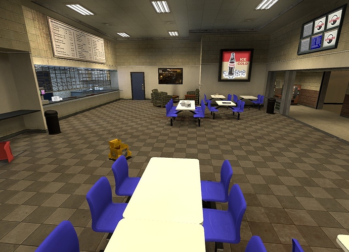
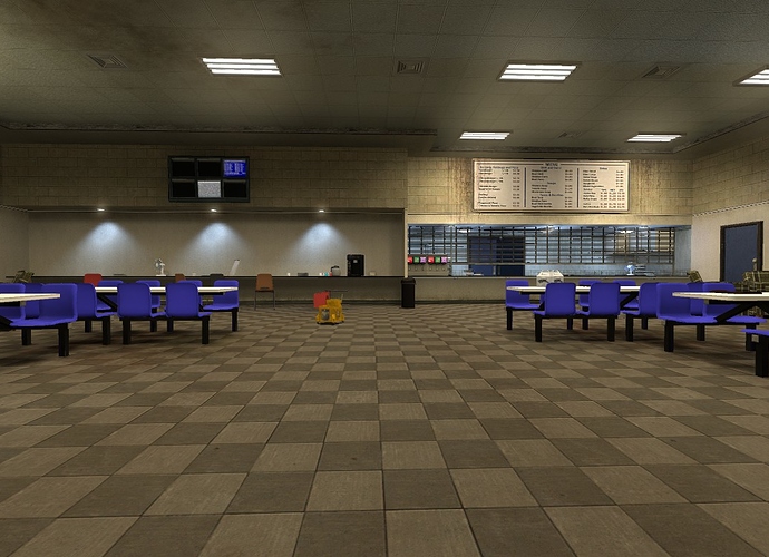
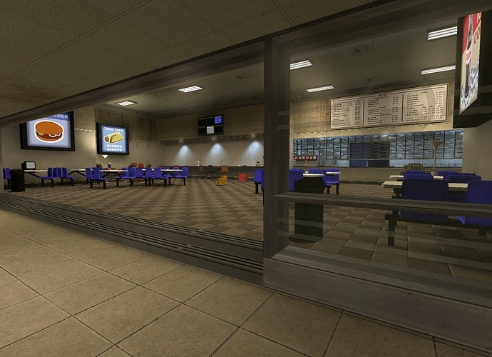
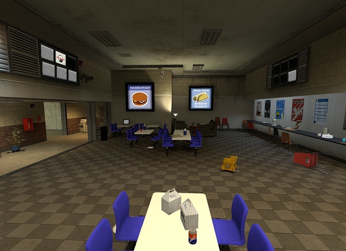
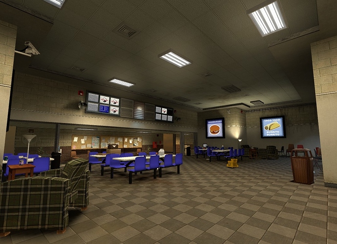
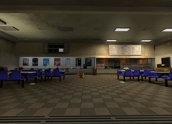
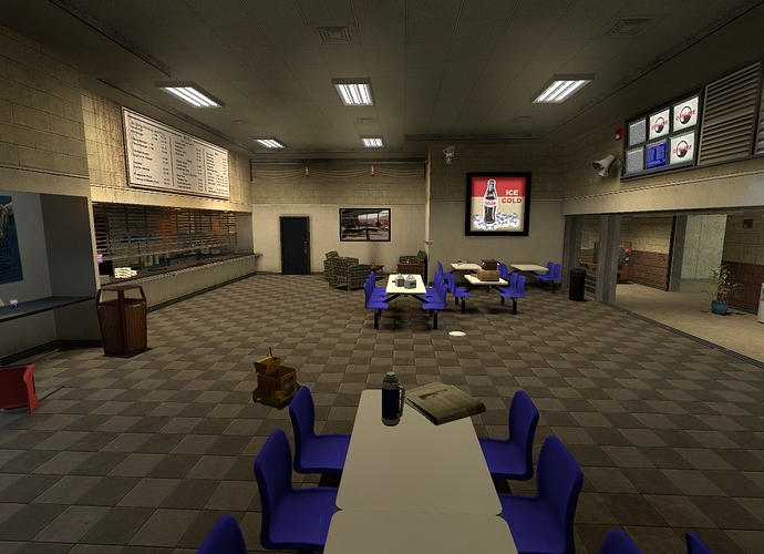
Made a cafeteria up real quick. I definitely like it better than the break room.

Yeah, even though this is relatively unpolished compared to the break room I already like it much more.

And another post with more pictures. It’s pretty much in a state now where I’m fairly happy with it and can move on to other areas without feeling like it’s horribly unfinished.

Hey any devs reading (or anyone else), does it really matter that I keep attaching all these pictures straight from my computer, or should I upload them elsewhere and link them here instead? I’m sure there’ll be many more pictures here before everything is all said and done.

This is looking great, but I’m not sure how I feel about the giant row of posters. Perhaps replace them with some of the revolving triangle boards from AM?

I have one of those in another corner actually, but yeah, I think it would look better there

It looks great… But not sure if it will play good. Most of your rooms seem very big, with only very few useful cover (if there is any) and still there are some obstacles to move around (for example all the tables and chars in the cafeteria). Not really sure how to improve it either…

Perhaps during the disaster, the facility personnel or the military built up barricades in here from the furniture?

Don’t worry, I’ll be adding some cover where appropriate. I have most of it planned out with non-textured blocks that are hidden when I take the screenshots, so you can see the environments. I’ll add in props or more detailed brushwork later in place of the blocks.

It probably won’t be military stuff though.

Edit: It’s probably not the best way to do it, but that how I’m doing it.

Still fine-tuning a lot of the areas.


Pipes and control room.


Inside the control room.


The elevator.

Another update. Dumping a whole lot of pictures.

So, since the last time, I’ve made some big changes to the outside area, mostly just making it a little bigger.

The crane control room/entrance.

In the middle of taking these pictures, I realized that I should change the metal siding control room into concrete so that it fit better with the rest of the structures. You can see the original one here, and the current concrete one in the previous pictures.

On one of the new catwalks.

Still working on the displacements and will do a 3D skybox at some point so that everything doesn’t end so abruptly.

An overview of the area. It’s not too much bigger than before, but it certainly doesn’t look too much like a box any longer.

Made the main lighting in the lobby a colder color and the spots warmer.

Now, on to the second floor, which is finally getting some work done to it. This room is, of course, directly below the lobby, but doesn’t have a purpose yet.

The motor room.

There are stairs that let you get up on the motors.

Under the grate, across from the red light, there’s a vent that leads straight into the third floor.

An exit from the motor room, leading downstairs and into the pipe room. This is mirrored on the other side.

The pipe room. I’m great with descriptions. The doorway on the left leads into the control room in the previous post.

The vent room. Most of these ducts you can’t get into.

That middle vent that goes into the floor runs from the cafeteria on the first floor, to here, then to the third floor.

This is astounding.

I’m really digging that generator room, but I’m thinking that concrete the support beams are made from stands out as a bit too bright…

The two pillars with the half walls on either side? I agree with that. I had actually saw that a while ago, but forgot about it, so thanks.

Or something else entirely?

Well, those too now that you mention them, but I originally meant the ones outside, on the Undertow-style concrete walls.

Ah, the ones on the big walls outside. Yeah, I’ve been struggling with finding the right texture for those for pretty much the entire time, but I’ve since made them darker, and they look alright now. Moreso than before, at least.

Founded in 2004, Leakfree.org became one of the first online communities dedicated to Valve’s Source engine development. It is more famously known for the formation of Black Mesa: Source under the 'Leakfree Modification Team' handle in September 2004.