Blog 12

Ok, I will try this again, but this is the last time I will do this if the thread derails like the last time and I’ll ban the derailer for a month and I will completely stop. Mods please have a quick trigger to pull stuff or warn people…

Today was spent trying to pull all the vmt/vtfs for the ion console into game. Bjorn compiled it and Chris placed the model for me in AM and UC. It turned out pretty good I think.
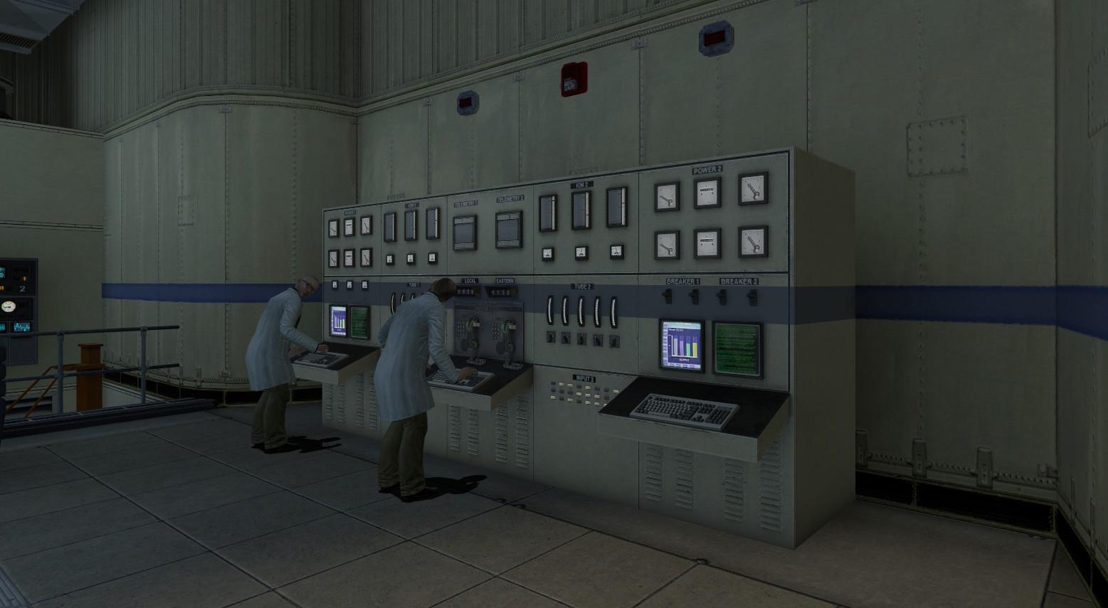
This is what it looked like before.
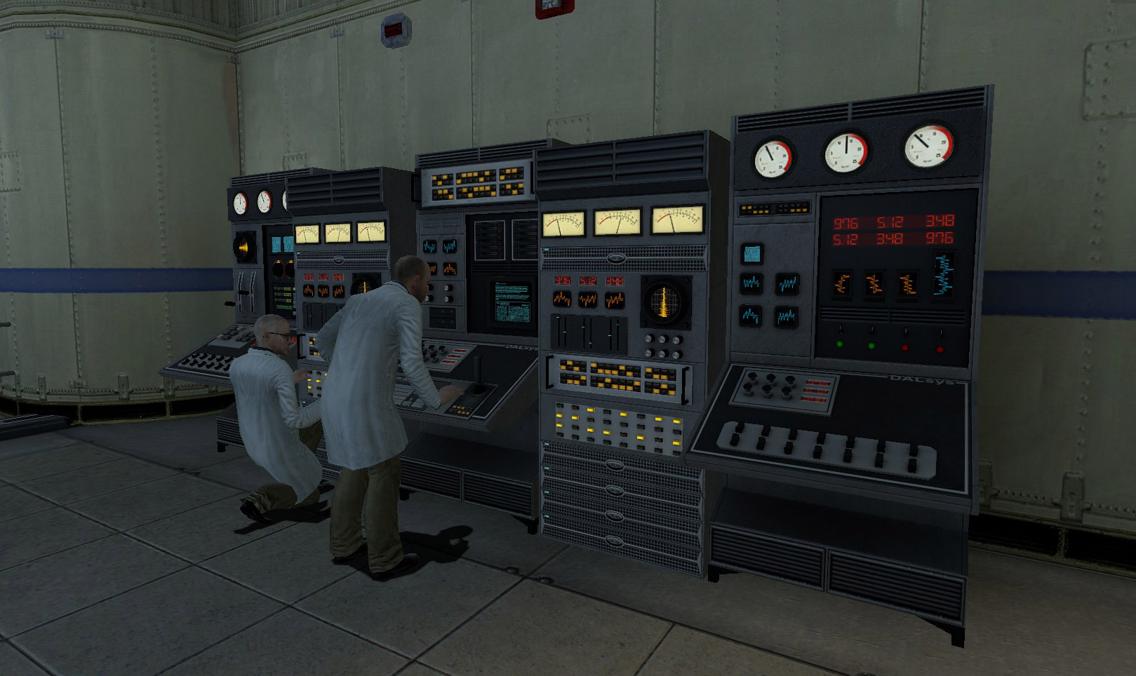

After


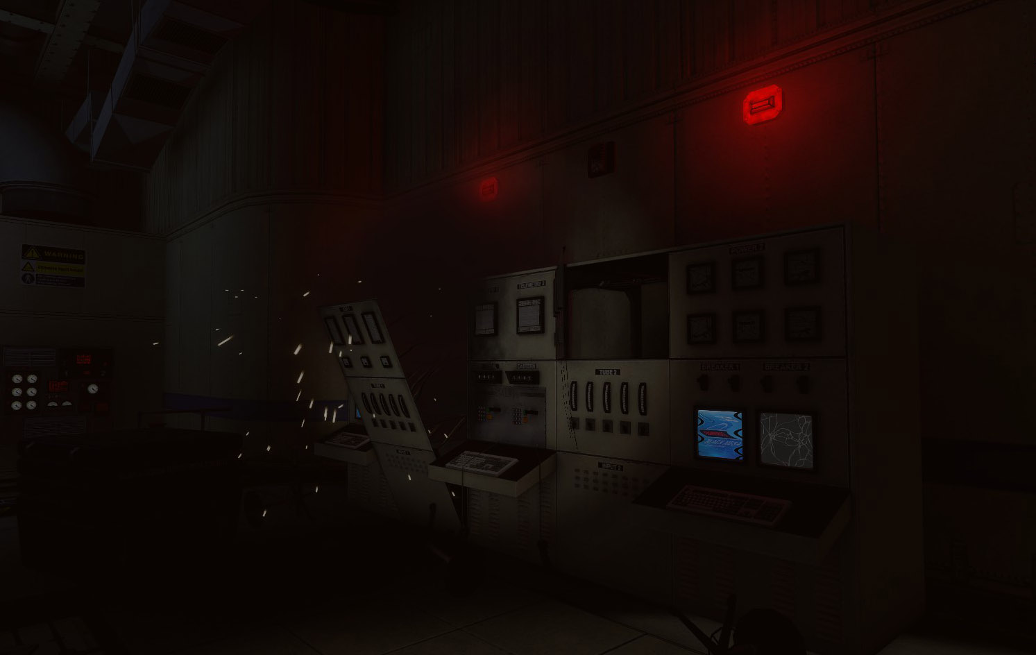
Then AM one had animated screens on the right and static on the left. The UC one has animated on the left and static broken on the right.

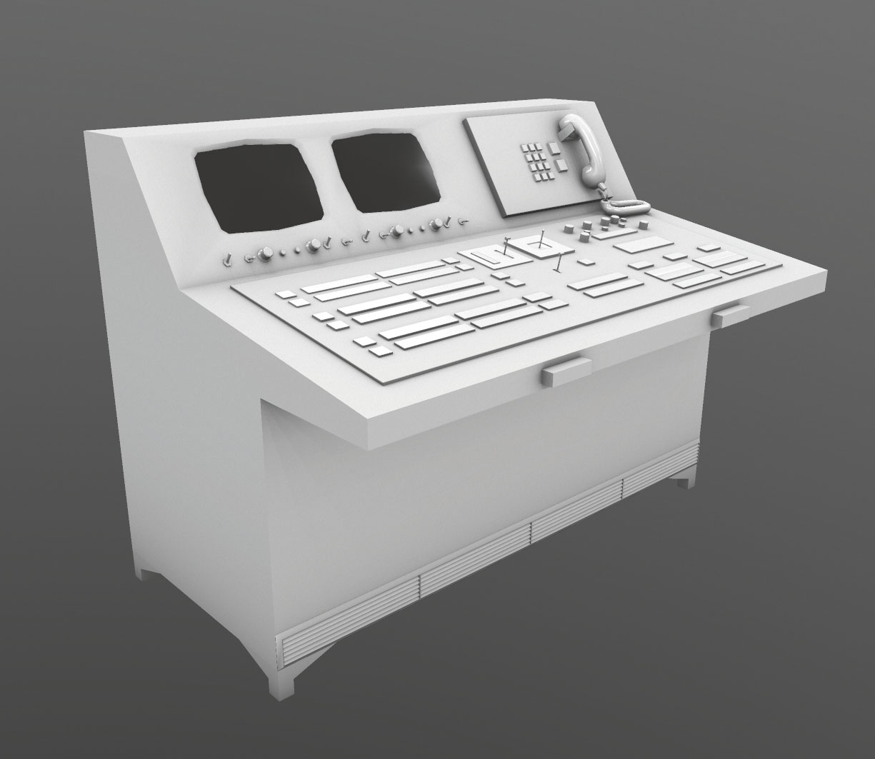
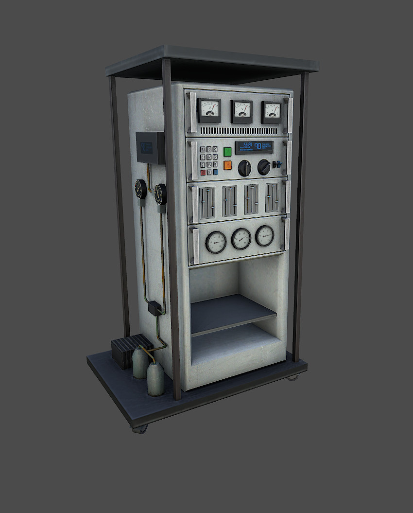
That took most of the morning and afternoon. In between I worked on redoing a SP prop, Turns out it was from HL2 but we have it all over the game. The UV was TERRIBLE, someone used auto unwrap…


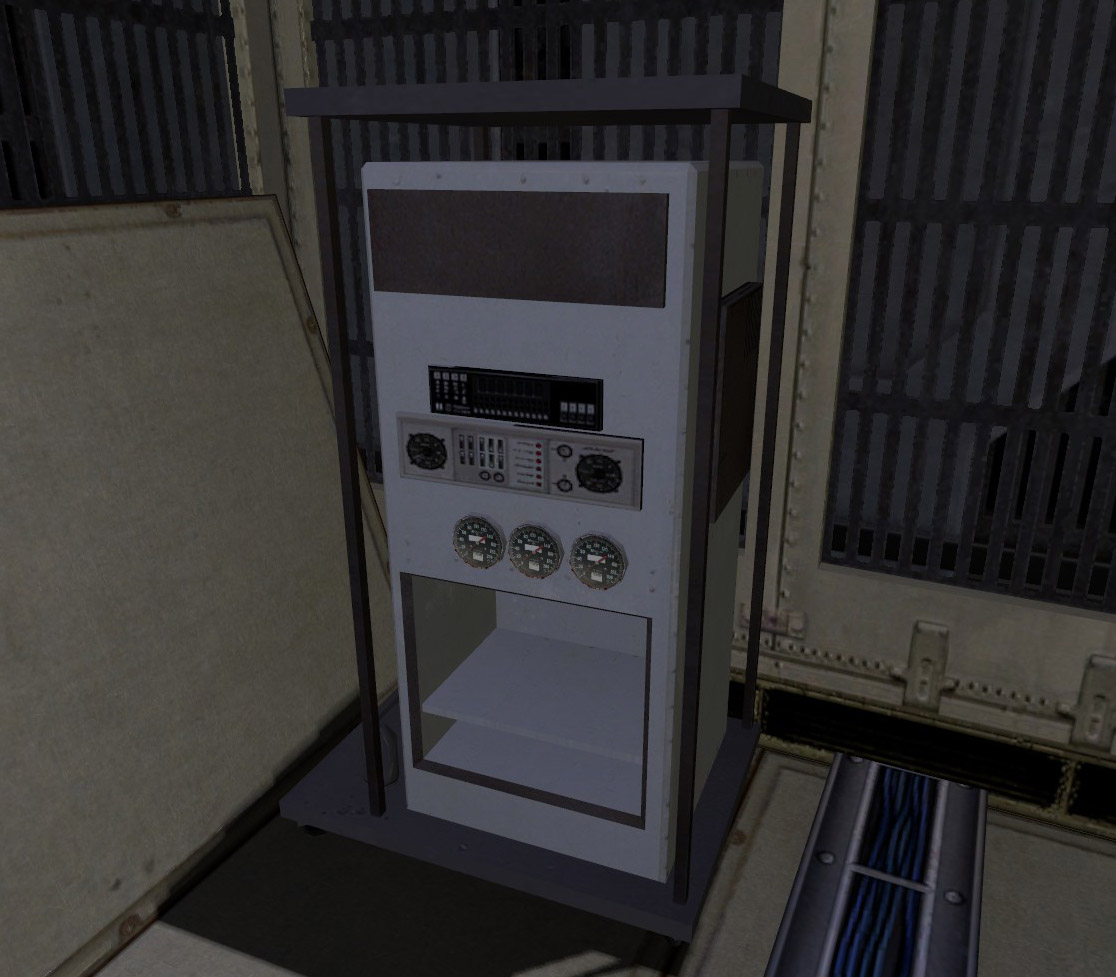
So I deleted most of the details, re-uved the cabinet, top/bottom and supports. Next detail pass and rearranging all the details on the new UV.
I am then left with this.

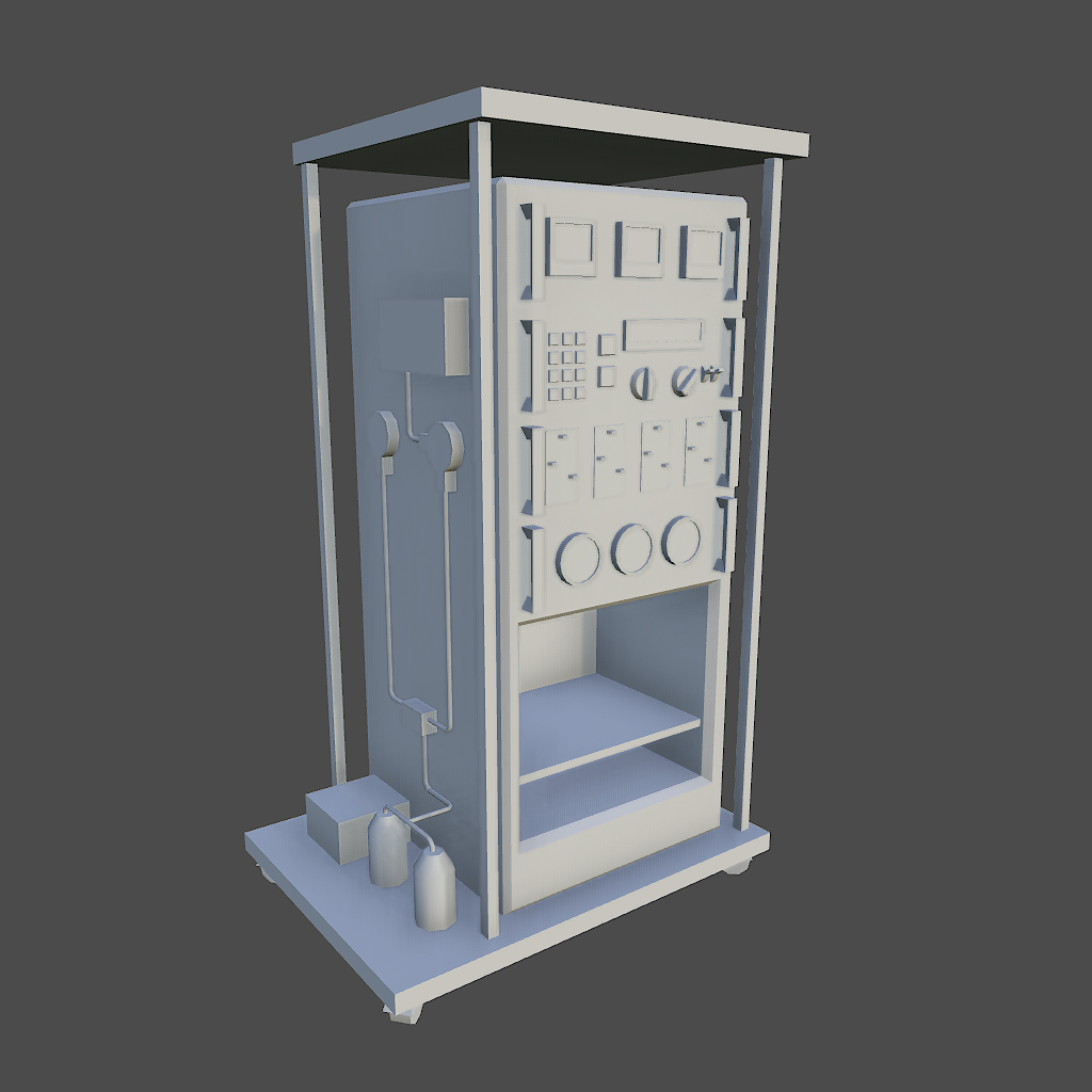
Baked a AO and did a base diffuse map.

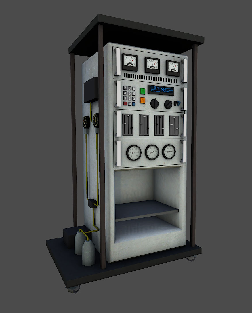
Then that was taken into dDo for a detailing and grunge pass.

All that is left is compiling. This would be a direct prop replacement so the LD’s shouldn’t have to do anything except rebuild the cubemaps.

Sorry somehow double posted. Also in the last 2 weeks I worked on this model redo.

Pretty. Reaaaaal pretty.

dam dude

Those are some really sexy looking models. How do you know what kind of buttons and gizmos to add to a model and will suit its design?

OMG, that looks fucking beautiful.

Looks really good.

Depends a lot on where it goes. If its a generally used all over model just some standard stuff. If it is used in a specific spot then I’ll research for stuff relating to the location. I have been looking for concepts and references for a long time (10+ years) so I have a good set of pics to work from. If its a specific model redo the I usually take what worked on the original model and add detail until I feel its balanced and until I run out of space. We try for a industrial/sci fi look so that is where I find most of the references.

Wow, that looks great. It fits into the environment even better than the previous model.

It also looks like it’s from the same time period ('round the 90’s) as HL1. That was one of my little peeves about BM when it initially came out (no criticism, it looks great either way imo). Otherwise, great work Brian.

COOOOL.

yup yup yup, that looks really neat! That new console in AM looks great, I really like that old cord-phones attached to the console. Great detail, bk, and thanks again for your updates! I am on the tip of my toes waiting for this! (still waiting patiently, though).

What about this blue line?

Superior work, as usual !

Constructive feedback:

  1. The numerical keypad seems reversed - numbers increase from bottom-to-top instead of top-to-bottom.
  2. In the third rack-mount unit, all slider buttons are in identical positions - can 1 or 2 be rotated 180° ?

It’s the same layout as a computer keyboard’s numpad. It makes sense it would be the same layout for scientists who use that numpad on computers for calculations.

  1. See below.
  2. Shared UV. IF the sliders were all different you would have a AO shadow in each of the positions on every single slider plate.

No… it’s not part of the wall.

Yeah, the line just makes it look silly. It’s a sign, don’t really need to mark the equipment.

Man, these models are so sexy. Great job on them!

The new AM/UC console fits much better with the aesthetics of the lab, and that next model is a huge improvement! I really like the colors, makes it look usable.

When working with other modelers/texturers (for instance I believe you have had Fleistad texture some of your models, while you have done others), how do you ensure that your work is of a consistent quality and aesthetic? Especially since that appears to be a lot of what you’re working on now. Is there a common document that describes the vision for each section/chapter? Or is there more of an informal understanding?

I texture my own props, Bard only did some when I was out. Bjorns props all have to be textured. We have done the prop thing for a long time so we pretty much have the style down. We do go through team review on them. Also if something doesn’t quite fit when in game it gets tweaked.

That has such a late-50s/early-60s look. I love how the different areas in the game look like thry’re from different time periods. :slight_smile:

never noticed anything wrong with the old one but it definitely does look much better now

thanks and please do show us more! thumbs up

Founded in 2004, Leakfree.org became one of the first online communities dedicated to Valve’s Source engine development. It is more famously known for the formation of Black Mesa: Source under the 'Leakfree Modification Team' handle in September 2004.